Spotlight
Iconic Everywhere: Coca-Cola made its global identity more Coca-Cola
 By Archit
·
·
5 min read
By Archit
·
·
5 min read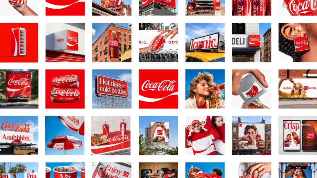
In July 2026, Coca-Cola introduced a global identity built around one strategic request. Make Coca-Cola more Coca-Cola. JKR developed Iconic Everywhere, while The SUPERULTRARARE reimagined the packaging system for use across more than 200 markets.
The update was not a redesign. Instead, it gave greater prominence to the colours, shapes and lettering people already connected with Coca-Cola.
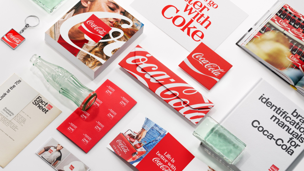
The refresh continued the work started in 2021
Coca-Cola’s previous global consistency push arrived in 2021 alongside the Real Magic platform and a refreshed visual identity.
That system introduced new ways to use the Coca-Cola script across campaigns. However, different markets, products and physical spaces could still present the brand in slightly different ways.
The 2026 project widened the task.
Packaging, retail signs, vending equipment, digital experiences and campaign materials now needed to feel like parts of one system. A Coca-Cola execution in one country should be immediately connected to another appearing thousands of kilometres away.
At the same time, the brand needed enough freedom for local markets to create work suited to their own languages, formats and audiences.
The answer was not to add more design elements. It was to organise the strongest existing ones.
Familiar assets moved to the front
The new system focused on four central parts of Coca-Cola’s identity.
The red-and-white palette became more dominant. The Spencerian script received greater scale. The Dynamic Ribbon moved more freely across layouts. Meanwhile, the Arden Square returned as an important brand mark.
The Arden Square combines the Coca-Cola script with a solid red frame. Its simple shape allows the brand to remain visible on shop signs, digital screens, equipment and small interfaces.
The Dynamic Ribbon could also do more than sit beneath the logo. It could stretch across packaging, frame an image or become the main feature of an execution.
Furthermore, the script could be enlarged, cropped or placed vertically while remaining recognisable. Some designs showed only a section of the lettering, trusting people to complete the name from memory.
That confidence came from Coca-Cola’s long visual history. The project treated recognition as something already earned rather than something that needed to be rebuilt.
As a result, individual executions could look different without appearing disconnected.
Packaging joined the same visual system
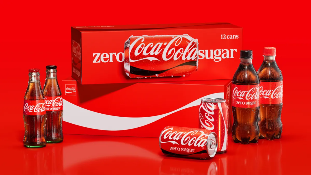
The packaging update brought Coca-Cola and Coca-Cola Zero Sugar closer together.
Cans used the script vertically, allowing the name to occupy more of the pack. Multipacks gave the ribbon and lettering enough space to become large graphic elements rather than small brand details.
Coca-Cola Zero Sugar retained its own product signals. The words “Zero Sugar” became larger, while a black Dynamic Ribbon appeared on cans and black caps identified plastic bottles.
However, the white script and red foundation connected it more clearly with the original Coca-Cola range.
The difference can be seen across the wider packaging family. Glass bottles, plastic bottles, cans and multipacks now share the same visual structure even when their proportions change.
The system also leaves room for flavours, languages and local product information. Those details can move between markets while the main Coca-Cola assets remain consistent.
Therefore, the packaging does not depend on one fixed layout. It depends on a small group of recognisable elements behaving in a controlled way.
One system had to work across 200 markets
A global identity must survive thousands of individual decisions.
Internal teams, bottling partners, retailers and outside agencies may all need to create Coca-Cola material. Each group works with different formats, deadlines and market requirements.
Coca-Cola introduced a Brand Center to place its principles, examples and assets in one location. It also connected the system with Design Intelligence tools intended to support consistency across creative software and large numbers of local adaptations.
Rapha Abreu, global vice president of design at The Coca-Cola Company, described the aim as creating “one seamless visual identity.”
That does not mean every billboard or bottle must look identical. It means the same visual language should remain clear across every application.
A local team can change the photography, message or language. Still, the red, script, square and ribbon provide a shared foundation.
More importantly, the system was designed for places beyond traditional advertising. It can appear on a delivery truck, shop refrigerator, menu screen, social post or building sign without losing the connection between them.
What Made It Different
Iconic Everywhere found change through stronger use of what Coca-Cola already owned.
The brand did not replace its script with a modern wordmark. It did not introduce a new colour palette or create another temporary campaign symbol.
Instead, JKR examined how familiar assets could become larger, clearer and more flexible.
That approach suited a brand whose identity already carried enormous recognition. A dramatic redesign could have weakened the memories attached to its existing materials.
The project also connected the visible design with the system behind it. Packaging, retail, equipment, digital experiences and global guidance were treated as parts of the same identity.
Its success will depend on how consistently those principles are used over time. The rollout began across Latin America, Europe, the Middle East and Asia, but the system is intended to guide the brand far beyond its launch year.
Coca-Cola did not need people to recognise something new.
It needed every appearance to feel more recognisably Coca-Cola.
Credits
Iconic Everywhere (2026). Coca-Cola, global. Global brand identity: JKR. Packaging design system: The SUPERULTRARARE. Global design leadership: Rapha Abreu, Global Vice President of Design at The Coca-Cola Company. Rollout: packaging, retail, equipment and digital experiences across more than 200 markets.
Related
More in Spotlight

Popular
Popular posts

More stories