Outdoor
Fractional Window Shopping: TD Bank used real logos without printing them
 By Archit
·
·
4 min read
By Archit
·
·
4 min read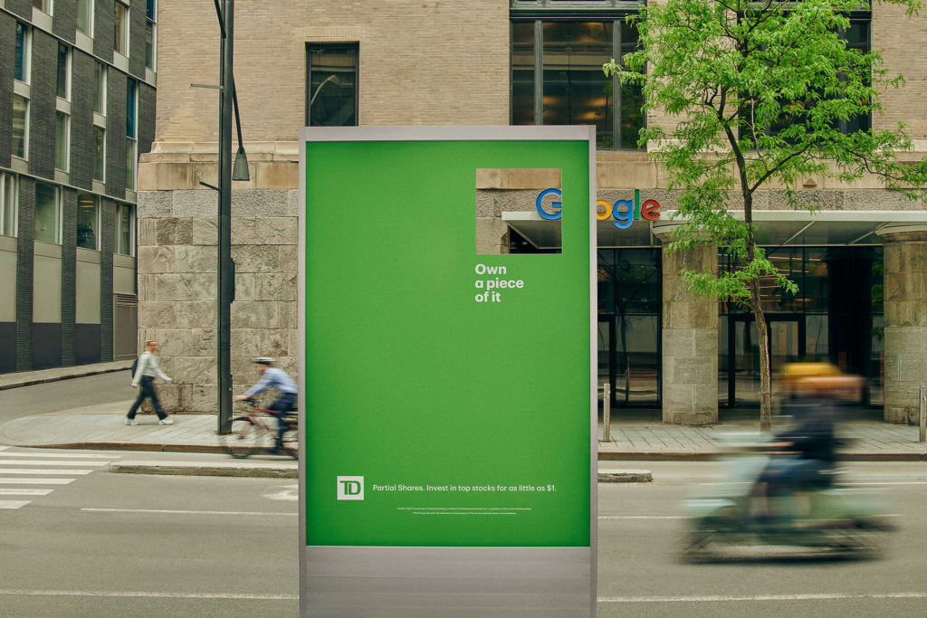
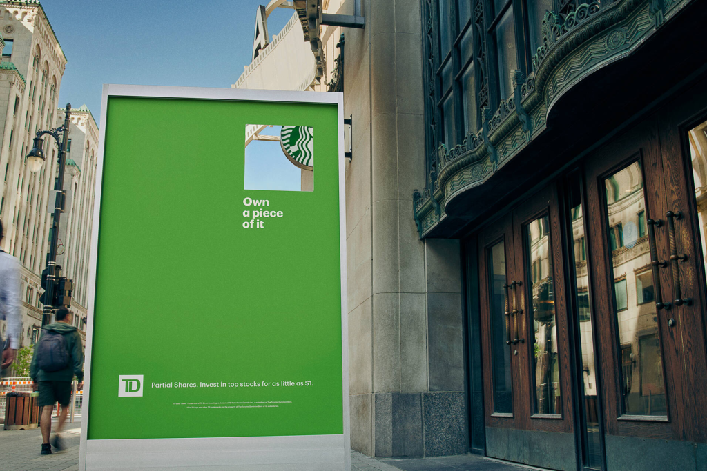
TD Bank wanted to advertise fractional shares in the companies people already knew. However, it could not simply print those companies’ logos across its own campaign. Ogilvy Canada found a way around the problem by leaving part of every billboard empty.
Fractional Window Shopping used laser-cut openings to frame pieces of real logos on nearby shops and offices. The billboard supplied the message. The city supplied the brands.
The Product Was Already a Fraction
Fractional shares let someone buy part of a stock rather than paying for one whole share.
That matters when the company is familiar but its share price feels out of reach. A new investor might visit its shops, use its products and recognise its logo every day without ever considering ownership.
TD needed to explain that shift in a quick, visual way. Meanwhile, the companies people might want to invest in had some of the most protected identities in the world.
The answer was to show only a piece.
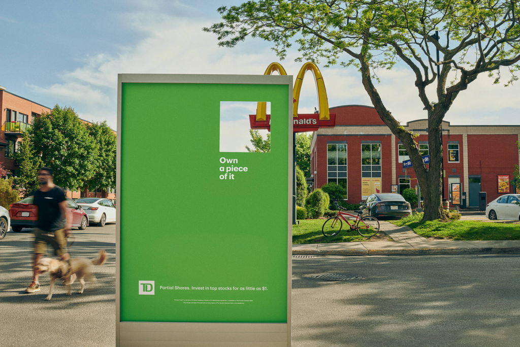
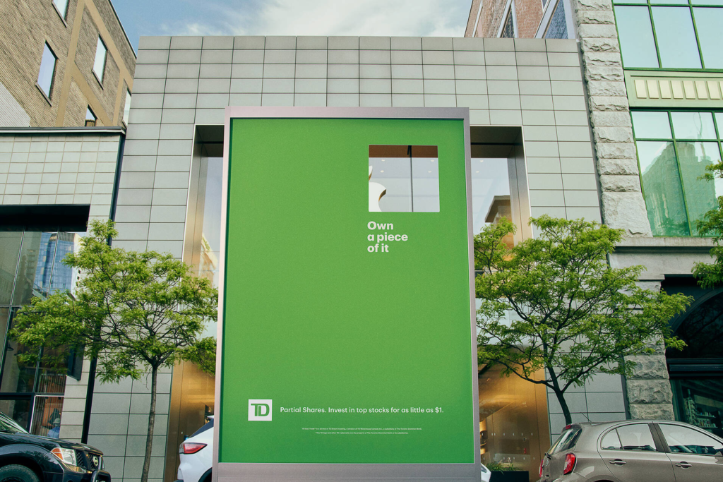
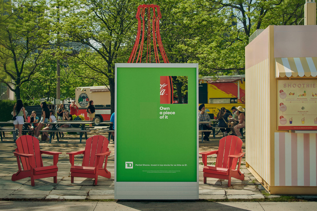
Each green TD board contained a square window. Through it, the viewer could see a fraction of a logo that already existed in the surrounding environment. The ads framed brands including McDonald’s, Starbucks, Nike, Apple and Google without reproducing their marks on the billboard itself.
The product explanation was built into the construction. People saw a fraction of a company while reading about buying a fraction of it.
Every Placement Had to Line Up
The campaign depended on perspective.
A cutout placed a few centimetres too high could reveal the wrong part of a sign. Similarly, a board positioned at the wrong distance could frame an empty wall or turn the logo into an unreadable shape.
Ogilvy measured each location separately. The team then adjusted the height, angle and distance of every structure so the opening revealed the intended piece from the main viewing position.
As a result, the same billboard design could not simply be copied from one street to another. Every logo sat at a different height and scale. Each location therefore required its own construction plan.
That precision gave the work its simplicity. The final poster looked like a green board with a hole in it. However, the idea only landed because the physical environment had been measured so carefully.
The City Became Part of the Ad
Fractional Window Shopping borrowed recognition without borrowing artwork.
A yellow curve, a white swoosh or part of a familiar wordmark was enough for people to identify the company. In fact, seeing less made the connection to fractional ownership clearer.
The campaign also changed the role of the storefront. It was no longer background behind the media. It became an active layer inside the message.
Meanwhile, the phrase “window shopping” gained a second meaning. Someone could stand outside a company, look through the TD window and imagine moving from customer to shareholder.
Each execution directed people towards TD Direct Investing, where they could learn about buying partial shares. More importantly, the journey from billboard to product did not need a long financial explanation. The physical cutout had already shown what a fraction looked like.
The Impact
The campaign reported a 78 percent increase in positive perception of TD among people exposed to the work. Furthermore, 42 percent of the new accounts linked to the campaign had already completed a fractional share trade when the results were entered for awards.
The work also received a Wood Pencil and a Bronze Pencil in 2026, along with further merit recognition across outdoor, design and experiential categories.
Still, the strongest part of Fractional Window Shopping was the match between the media and the product. The audience did not see a diagram explaining partial ownership. It saw a real company through a partial opening.
TD could not print the whole logo. That restriction gave the campaign exactly the amount it needed.
Credits
Fractional Window Shopping (2025) — TD Bank and TD Direct Investing, Canada. Agency: Ogilvy Canada, Toronto. Chief Creative Officer: Francesco Grandi. Group Creative Director: Randy Stein. Copywriters: Chris Belanger and Andrew Erskine. Art Directors: Audrey Laliberte, Lenilson Lima, Pedro Minari Felippe and Emmanuel Torres. Chief Strategy Officer: Jeremy Daly. Strategy: Sarah Almond, Maddie Pace and Andrea Eden. Production: Shoot Studio. Structures: Accordex. Photographer: Martin Girard. Retouching: Marcus Cabral.
Related
More in Outdoor

Popular
Popular posts



More stories