Travel: McDonald’s made the Golden Arches feel like home in an unfamiliar country
 By Archit
·
·
5 min read
By Archit
·
·
5 min readAI-assisted
Quick summary
The idea: McDonald's Mexico and DDB Mexico created "Travel" to position the restaurant as a reassuring, familiar refuge for exhausted travellers navigating unfamiliar foreign destinations.
The execution: The print series featured visually simple posters set in diverse cultural locations like Russia, Japan, Egypt and Korea. Relying on high brand recognition rather than lengthy copy, the ads contrasted foreign environments with the instantly recognisable McDonald's identity.
Why it matters: The campaign turned international brand consistency into an emotional benefit of comfort and certainty. It earned widespread industry recognition, including the Grand Prix at the Circulo Creativo de Mexico, Silver at El Ojo de Iberoamerica, and a Graphite Pencil at the 2019 D&AD Awards.
AI-generated from this article. For complete context and credits, read the full story.
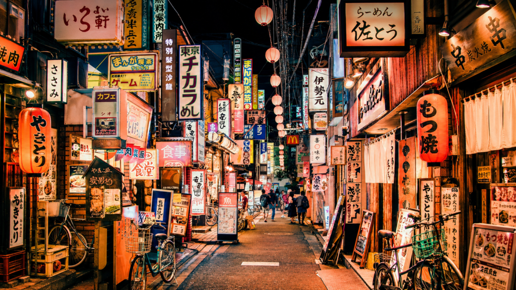
Travelling offers new cultures, landscapes and experiences, but it can also make simple tasks unexpectedly difficult.
Unfamiliar languages, different food and unknown streets can become tiring, particularly when travellers are far from home. McDonald’s Mexico used that tension for “Travel,” a print campaign created by DDB Mexico.
The campaign presented McDonald’s as a familiar point inside an unfamiliar destination. Whatever else might change during a journey, the Golden Arches offered something travellers could immediately recognise.
The campaign focused on a less glamorous side of travel
Most travel advertising concentrates on discovery. It shows famous landmarks, beautiful scenery and the excitement of visiting somewhere new.
“Travel” approached the subject from the opposite direction. It acknowledged that exploring another country can sometimes feel confusing, uncomfortable or exhausting.
The campaign did not argue against adventure. Instead, it recognised the moment when a traveller needs a short break from it.
Finding a McDonald’s in that situation can offer relief. The menu, branding, ordering system and restaurant experience are already familiar, even when everything outside feels different.
That simple human observation became the foundation of the campaign.
Different countries became individual executions
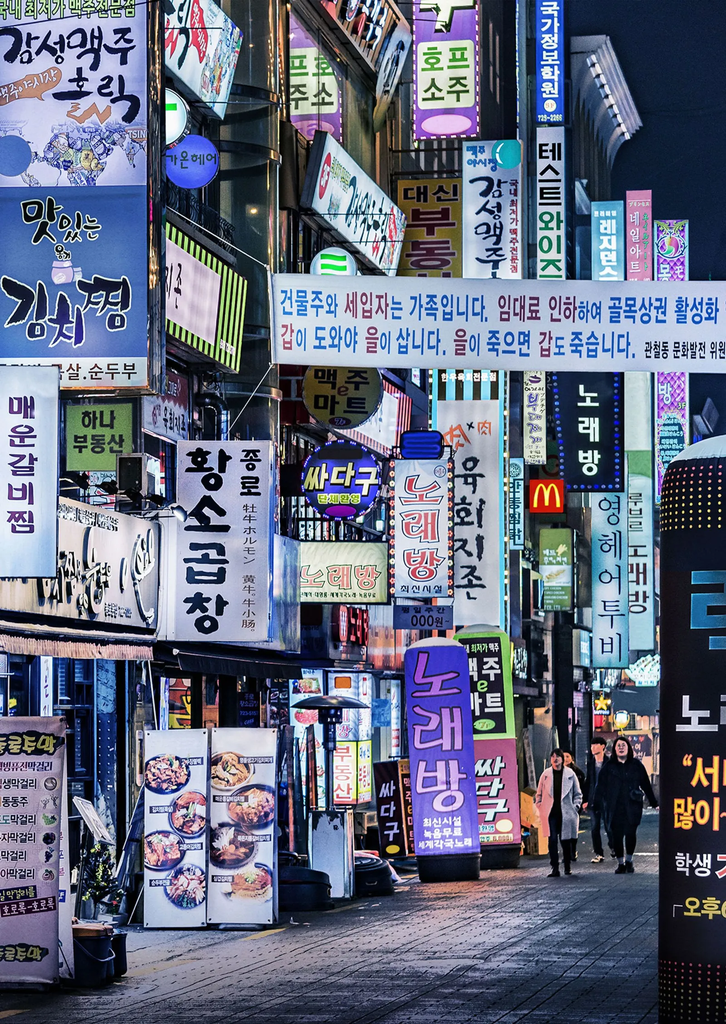
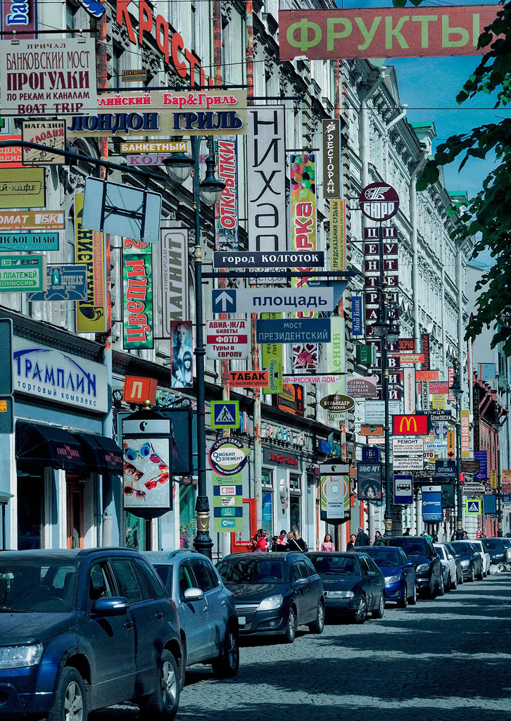
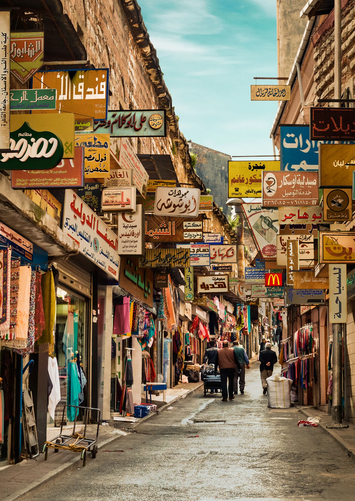
The print series included posters based on destinations such as Russia, Japan, Egypt and Korea.
Each execution placed the idea inside a different cultural setting, allowing the unfamiliarity to change while the role of McDonald’s remained consistent.
The countries were not selected to promote particular menu items or restaurant locations. They helped demonstrate the scale of the brand’s familiarity.
A traveller may not understand every sign, custom or local dish, but the McDonald’s identity can still be recognised almost immediately.
By repeating the structure across different destinations, the campaign transformed one observation into a flexible print system.
McDonald’s became an emotional landmark
The campaign did more than communicate that McDonald’s has restaurants around the world.
Global availability is a practical benefit, but “Travel” gave it an emotional role. The restaurant became a landmark of certainty, offering a moment in which the traveller did not have to translate, investigate or take another risk.
This positioned familiarity as comfort rather than boredom.
For people at home, McDonald’s may feel like an ordinary part of the local environment. In another country, however, the same branding can suddenly carry more emotional value.
The campaign captured that change in perspective. Distance made something routine feel reassuring.
The idea relied on recognition instead of explanation
McDonald’s possesses one of the most recognisable visual identities in the world. The Golden Arches, red and yellow colour palette, packaging and restaurant design can communicate the brand before its name is read.
“Travel” used that recognition as part of the creative mechanism.
The posters did not need lengthy copy explaining restaurant availability or international consistency. The audience could understand the contrast between a foreign environment and a familiar brand through a single image.
This made the campaign appropriate for both print and outdoor media, where viewers may only give an advertisement a few seconds of attention.
The visual simplicity also allowed the audience to bring its own travel memories to the work. Anyone who has entered a familiar restaurant while tired, lost or overwhelmed could understand the feeling immediately.
Consistency became the product benefit
Global brands often adapt their menus and communication to different markets. McDonald’s itself offers country-specific products influenced by local tastes.
Despite those differences, the central experience remains recognisable. Customers broadly understand what the restaurant offers, how to order and what type of service to expect.
“Travel” converted that consistency into a competitive advantage.
The campaign was not selling one burger or limited-time promotion. It was selling confidence. McDonald’s became the place where a traveller could stop making decisions and choose something known.
This gave the brand a useful role within the journey without claiming to replace the culture or food of the destination.
The posters received major creative recognition
The campaign was released in Mexico in July 2018 and received several awards for its print concept and execution.
It won the Grand Prix and Gold for Print Campaign at the 2018 Círculo Creativo de México awards. Individual posters based on Japan, Egypt and Korea also received Silver recognition.
The work earned Silver for Print Campaign at El Ojo de Iberoamérica in 2018. It later received a Graphite Pencil in the Press Advertising Campaigns category at the 2019 D&AD Awards.
These awards recognised how the campaign connected a simple travel insight with an established brand truth.
No commercial results, restaurant traffic figures or sales increases were publicly announced.
A familiar brand offered relief from the unfamiliar
“Travel” worked because it identified a moment that conventional tourism communication often ignores.
People may travel because they want unfamiliar experiences, but that does not mean they want every moment to be difficult. Sometimes, finding something recognisable provides the pause needed to continue exploring.
McDonald’s did not need to create a new product or service to meet that need. DDB Mexico simply changed the context in which people considered the existing restaurant experience.
At home, McDonald’s was familiar. Abroad, that familiarity became the benefit.
Credits
“Travel” was created for McDonald’s Mexico by DDB Mexico. David Castellanos served as Chief Creative Officer, Rodrigo Zúñiga as Creative Director, Javier Melo as Art Director and Kevin Murcia as Copywriter. David Rodríguez was Chief Strategy Officer, Paola Malanco led client services, Violeta López Pacheco was Head of Production and Dario Casso was Producer. Michel Capuano represented the brand as Brand Manager, Pietro Primavera handled photography, and Eugenio Reyes and Belinda Téllez were responsible for retouching.
About the work
Campaign details
Related
More in Print


Popular
Popular posts



More stories