Outdoor
Always Turns Its Name Into a Promise in London OOH Campaign
 By Archit
·
·
3 min read
By Archit
·
·
3 min readAI-assisted
Quick summary
Period care brand Always has launched a London outdoor and social campaign created by Saatchi & Saatchi London that contrasts the certainty of its name with the unreliability of "sometimes." Across static and digital London Underground placements and social content, minimal layouts featuring the brand's blue and turquoise colours pair bold headlines with the Always logo to complete each message.
Executions include lines such as "Superior protection doesn’t do ‘sometimes’" and "There’s a reason we’re not called sometimes." By using the brand name as the punchline and final conclusion, the campaign focuses on the emotional benefit of reliability rather than listing technical features, connecting consistent protection directly to everyday routines.
AI-generated from this article. For complete context and credits, read the full story.
A brand name can communicate more than the product it identifies. For period care brand Always, its name also expresses consistency, reassurance and protection that people can depend on.
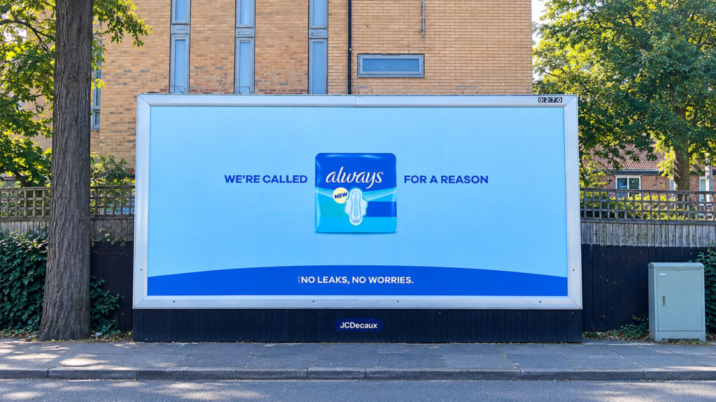
Always placed that meaning at the centre of an outdoor campaign across London. Created by Saatchi & Saatchi London, the work used short lines that contrasted the certainty of “Always” with the unreliability of “sometimes.”
The brand name then completed each message, allowing one familiar word to carry the campaign’s entire promise.
The brand name completed the headline
One of the campaign’s main executions read, “Superior protection doesn’t do ‘sometimes’.” Positioned beside the Always branding, the line allowed the logo to provide the natural conclusion.
Another execution stated, “There’s a reason we’re not called sometimes.” The sentence made the brand name part of the joke while reinforcing its connection to dependable period protection.
Supporting messaging such as “No leaks. No worries.” brought the idea back to a clear product benefit. The ads connected the name Always with the confidence of knowing that the protection should remain consistent throughout the day.
The concept required little explanation because the contrast between “always” and “sometimes” was instantly understandable.
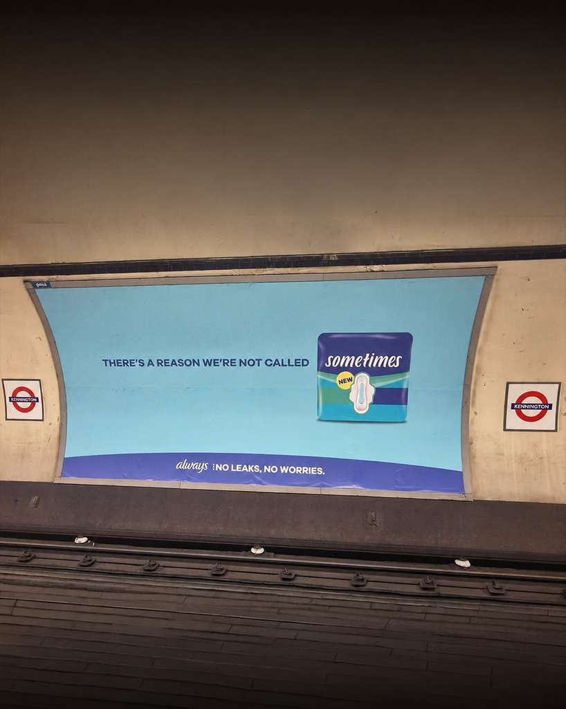
Minimal design kept attention on the promise
The campaign used a simple visual system built around large copy, the Always logo and the brand’s familiar blue and turquoise colours.
The restrained layout helped the headlines remain readable in busy transport environments. Commuters could understand the message while walking through a station or waiting on a platform.
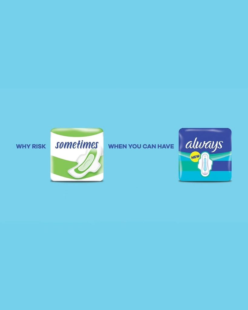
Product imagery supported selected executions without competing with the copy. In another part of the campaign, the question “Why risk sometimes when you can have Always?” appeared alongside period-care products.
Static and digital formats carried the idea across London Underground locations. The campaign was also extended to social content, where its short structure could work without requiring a longer explanation.
Reliability became the product benefit
Consistency is particularly important within period care. Consumers need products that can provide protection without creating additional worry during daily routines, travel, work or exercise.
The campaign used the word “Always” to express this need in a direct and memorable way. Rather than listing several technical features, the copy focused on the emotional benefit behind those features: reliability.
The writing also created a clear connection between the company’s name and the reason someone might choose its products. “Always” stopped functioning only as a logo and became the answer to the problem presented in every headline.
This allowed the campaign to communicate confidence without making the layouts crowded or the language overly complicated.
A familiar word created multiple executions
The idea could be adapted across different placements because the contrast between “always” and “sometimes” provided a flexible writing system.
Each execution could introduce a slightly different point about protection, leaks or uncertainty while arriving at the same conclusion. The brand name consistently delivered the final word.
That structure gave the campaign continuity across outdoor and social formats. People did not need to see every execution to understand the idea, but repeated exposure strengthened the connection between Always and reliable protection.
By allowing its name to finish the message, Always turned a simple piece of language into a clear product promise.
Credits
The campaign was created for Always by Saatchi & Saatchi London. Glenn Smith and Aimee Marshall served as creatives, with Oliver Farrington as executive creative director. The campaign ran across static and digital outdoor formats in London, United Kingdom.
About the work
Campaign details
- Brand
- Always
- Agency
- Saatchi & Saatchi
- Country
- United Kingdom
- Year
- 2026
Related
More in Outdoor


Popular
Popular posts

More stories