Editor's Pick
Rio Anti-Vaping Ads Turn Decaying Fruit Into Diseased Human Lungs
 By Archit
·
·
4 min read
By Archit
·
·
4 min readAI-assisted
Quick summary
A public-awareness campaign for the Government of Rio de Janeiro created by Brazilian agency Propeg uses CGI imagery of decaying fruit arranged in the shape of human lungs to warn against the dangers of electronic cigarettes.
The campaign addresses the misconception that sweet flavours make vaping harmless by pairing popular fruit names and rotting visuals with serious respiratory conditions, such as strawberry-flavoured emphysema and mango-flavoured fibrosis. By turning the appealing visual language of fruit against the product, the posters aim to challenge the innocence commonly associated with electronic cigarettes and young audiences.
AI-generated from this article. For complete context and credits, read the full story.
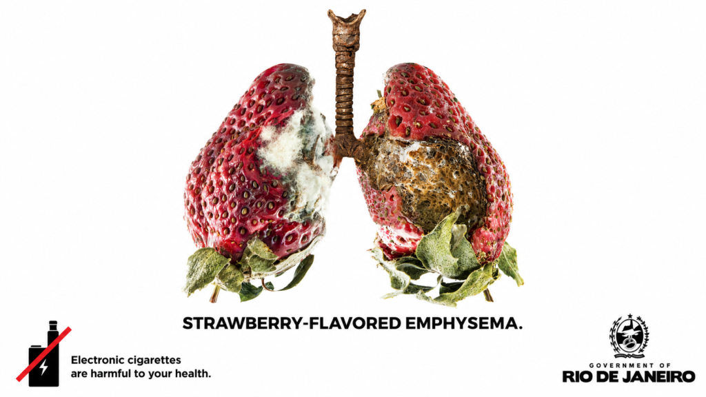
Sweet fruit flavours can make vaping appear more appealing, particularly to younger audiences. A public-awareness campaign from the Government of Rio de Janeiro responded by showing what those flavours could never make harmless.
Created by Brazilian agency Propeg in 2025, the anti-vaping campaign arranged decaying fruit in the shape of human lungs. Each execution connected a popular vape flavour with a serious respiratory condition.
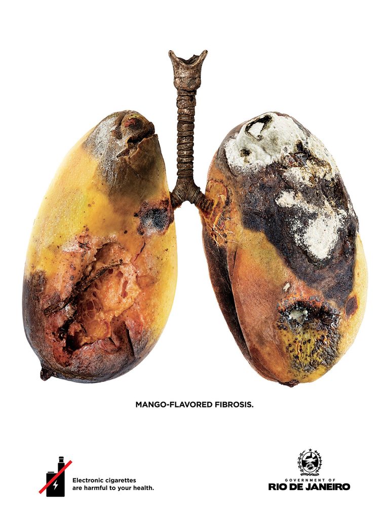
“Strawberry-flavoured emphysema” appeared beside lungs made from rotting strawberries, while “Mango-flavoured fibrosis” used damaged mangoes to communicate the same warning.
The unpleasant visuals challenged the attractive flavours, colours and product names commonly associated with electronic cigarettes.
Sweet flavours were given an uncomfortable meaning
Fruit-flavoured vape products can feel distant from the appearance and smell of traditional cigarettes. Their sweet names and colourful presentation may make the act of vaping seem cleaner or less concerning.
The campaign turned that visual language against the product.
Instead of showing fresh, colourful fruit, the posters presented fruit in an advanced state of decay. Mould, bruising and damaged surfaces gave the lung-shaped arrangements the appearance of diseased tissue.
The transformation was immediately understandable. What initially looked like a food image became a warning about what users inhale into their bodies.
By connecting each flavour with a lung condition, the campaign removed the sense of innocence created by words such as strawberry and mango.
Rotten fruit formed a pair of lungs
The posters used a restrained composition that placed the fruit lungs against plain backgrounds. This kept attention on their shape, texture and deterioration.
The imagery was created through CGI, allowing individual pieces of fruit to be arranged into recognisable lungs while retaining enough natural detail to feel uncomfortable.
There were no people, vaping devices or medical diagrams competing for attention. The fruit itself carried both sides of the message. It represented the flavour used to attract consumers and the physical harm the campaign wanted them to consider.
The short headlines completed the connection. Pairing a familiar flavour with a serious disease created an unexpected phrase that was easy to remember.

The campaign addressed a dangerous misconception
The campaign was developed as vaping continued to grow in popularity, especially among young people. It responded to the belief that electronic cigarettes were harmless simply because they did not look, smell or taste like traditional cigarettes.
Vape aerosols can contain nicotine and other potentially harmful substances. Flavouring does not remove those risks, even when a product tastes like fruit or sweets.
The campaign did not attempt to present a detailed comparison between vaping and smoking. Its message was more direct: attractive flavours should not be mistaken for safety.
This distinction allowed the posters to communicate a health warning without requiring audiences to read a long explanation. The deteriorating lungs provided the emotional impact, while the headlines identified the potential consequences.
One image exposed two different realities
The strength of the campaign came from combining attraction and decay within the same object.
Fruit usually communicates freshness, colour and health. Here, it became a symbol of respiratory damage. That contradiction encouraged viewers to reconsider the way flavoured vaping products were presented.
The campaign also avoided making the electronic cigarette itself the visual focus. Instead, it showed the body part that may be affected, using a material already associated with the flavours being promoted.
By reshaping decaying strawberries and mangoes into human lungs, the Government of Rio de Janeiro delivered a simple warning: a pleasant flavour cannot make inhaling chemicals risk-free.
Credits
The campaign was created for the Government of Rio de Janeiro by Propeg. Vítor Barros served as CEO, with Emerson Braga and Hermes Zambini as chief creative officers, Melina Romariz as chief strategy officer, João Caetano Brasil as executive creative director, André Batista as head of art, Bernardo Cople as creative director, Rodrigo Lopes Cardoso as art director and Fernando Goulart as copywriter. Account management was handled by Isabela Fogaça and Isabela Furniel, with media by Marilene Diogo Fernandes and production by Priscila Motta, Bruno Carneiro and Luciano Araújo. CGI was created by George Rutherford and Arie Fernando Magalhães, with client approval from Igor Marques.
About the work
Campaign details
Related
More in Editor's Pick


Popular
Popular posts



More stories