Taste Can’t Wait: Coca-Cola turned everyday objects into emergency bottle openers
 By Archit
·
·
6 min read
By Archit
·
·
6 min readAI-assisted
Quick summary
The idea: Ogilvy Spain created Taste Can't Wait for Coca-Cola in 2024, turning the glass contour bottle's need for a bottle opener into proof of craving. Instead of waiting for a proper tool, people use everyday objects to open the drink.
The execution: The campaign uses films and six photographic print executions. The films capture people improvising with phones, keys, and furniture to pry open caps, building anticipation for the first sip. The print ads show close-ups of the resulting damaged edges and chipped surfaces alongside a bottle and the campaign tagline.
Why it matters: The work communicates strong taste appeal by highlighting real consumer behaviour rather than listing product ingredients. It turns a functional packaging inconvenience into a simple, repeatable visual concept across multiple formats.
AI-generated from this article. For complete context and credits, read the full story.
The Coca-Cola glass bottle is one of the most recognisable pieces of packaging in the world, but its metal cap creates a small problem when no bottle opener is available.
“Taste Can’t Wait” turns that inconvenience into evidence of desire.
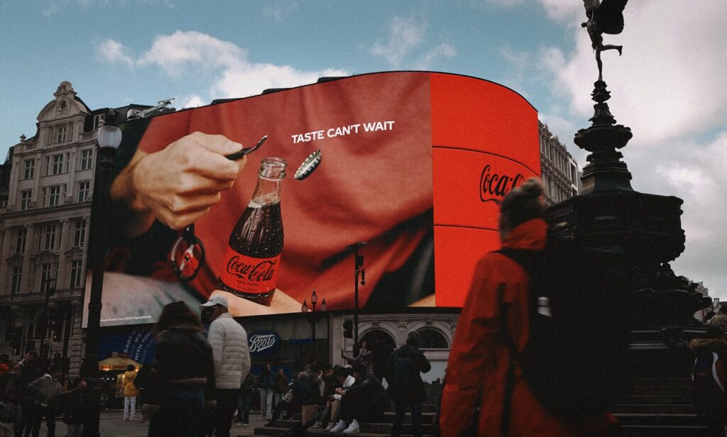
Created by Ogilvy Spain, the 2024 campaign shows how people use phones, keys, furniture and other nearby objects to open a bottle rather than wait for the correct tool.
Through films and six photographic print executions, Coca-Cola transformed an ordinary habit into a simple statement about the strength of its taste appeal.
The iconic bottle’s weakness became the idea
Coca-Cola has spent decades building recognition around its glass contour bottle.
Its shape can identify the brand without a visible name, while the experience of opening the metal cap has become part of the product ritual. The release of pressure, fizzing carbonation and first sip all contribute to the anticipation.
The problem begins when someone has the bottle but cannot find an opener.
Instead of ignoring that functional weakness, “Taste Can’t Wait” places it at the centre of the campaign. The inconvenience becomes proof that people want the drink badly enough to improvise.
Waiting until an opener appears is presented as the least realistic option.
Everyday objects become unexpected tools
The campaign is based on a widely recognised behaviour: using whatever hard edge is available to remove a bottle cap.
A mobile phone, table, key and other personal objects become emergency openers. They may not be designed for the task, but the desire to reach the Coca-Cola inside the bottle makes them useful.
Each improvised method carries a small risk of scratching, denting or damaging the object.
That willingness to accept the damage strengthens the message. The person is not carefully considering the value of the phone or furniture. The immediate priority is opening the Coke.
The campaign therefore communicates taste without describing ingredients, sweetness or refreshment. It demonstrates craving through behaviour.
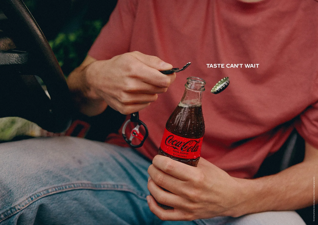
The print campaign shows what happened afterwards
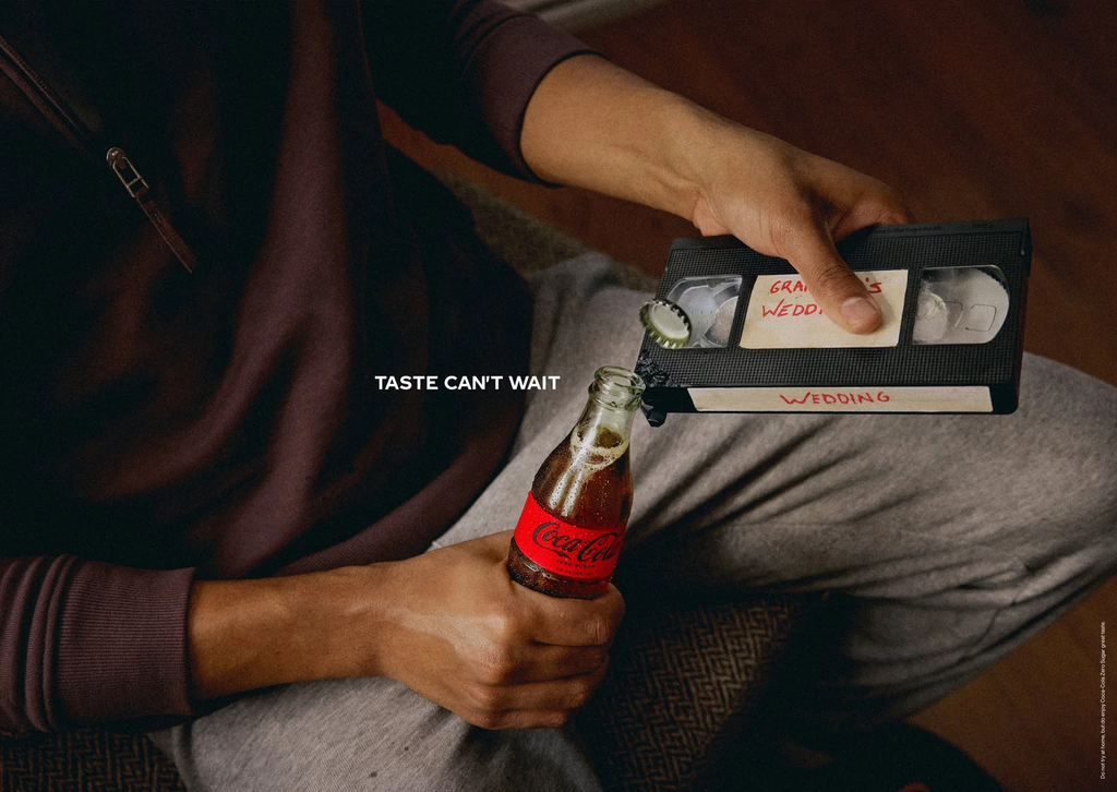
The photographic posters concentrate on the marks left behind by the bottle-opening attempts.
Instead of showing someone performing the action, the images present damaged edges, chipped surfaces and recognisable objects that have clearly been used against a metal cap.
A bottle and the line “Taste Can’t Wait” provide the explanation.
This approach asks the viewer to reconstruct the missing action. The damage becomes visual evidence of how urgently someone wanted the drink.
The posters are especially effective because the idea can be understood quickly. A close-up photograph, a familiar mark and a short line communicate the full story.
Each new object also creates another execution without changing the central structure, giving the campaign a repeatable visual system.
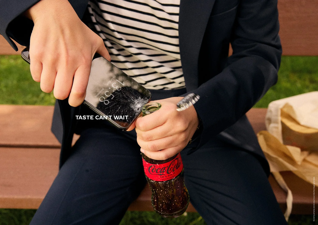
The films turn impatience into anticipation
The films show the behaviour that the print advertisements leave unseen.
People look for ways to remove the cap using the objects around them. The action builds towards the familiar opening moment, followed by the release of carbonation and the reward of drinking a cold Coke.
Close-up photography gives the films a tactile quality. Hard surfaces, glass bottles and metal caps create a sequence of recognisable sounds and textures.
The viewer understands the risk of using an unsuitable object, but also understands why the character continues.
By making the opening process slightly difficult, the films increase anticipation around the product. The delay makes the eventual first sip feel more satisfying.
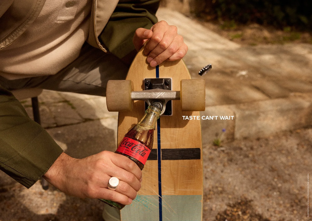
The product remains at the centre of every execution
“Taste Can’t Wait” does not depend on a celebrity, cultural event or complicated activation.
Its creative idea comes directly from the product’s packaging and the behaviour surrounding it.
The glass bottle creates the obstacle, the cap creates the action and the taste provides the motivation. Every part of the campaign therefore leads back to Coca-Cola.
This makes the work highly recognisable even when branding is minimal. Few other products have the same combination of bottle shape, metal cap and cultural familiarity.
The campaign uses that recognition to let viewers fill in details that never need to be explained.
A familiar visual approach received comparisons
The print executions also prompted comparisons with Stella Artois’ “Reassuringly Expensive” campaign from 1999.
That earlier work showed expensive objects and surfaces damaged after being used to open beer bottles. The marks suggested that people were willing to risk valuable possessions for the product, reinforcing the beer brand’s premium positioning.
“Taste Can’t Wait” uses a similar visual structure but connects it to a different message. The Coca-Cola campaign focuses on impatience and immediate craving rather than price or luxury.
The comparison shows how the same human behaviour can support different strategic ideas, while also demonstrating the importance of advertising history when developing visual concepts.
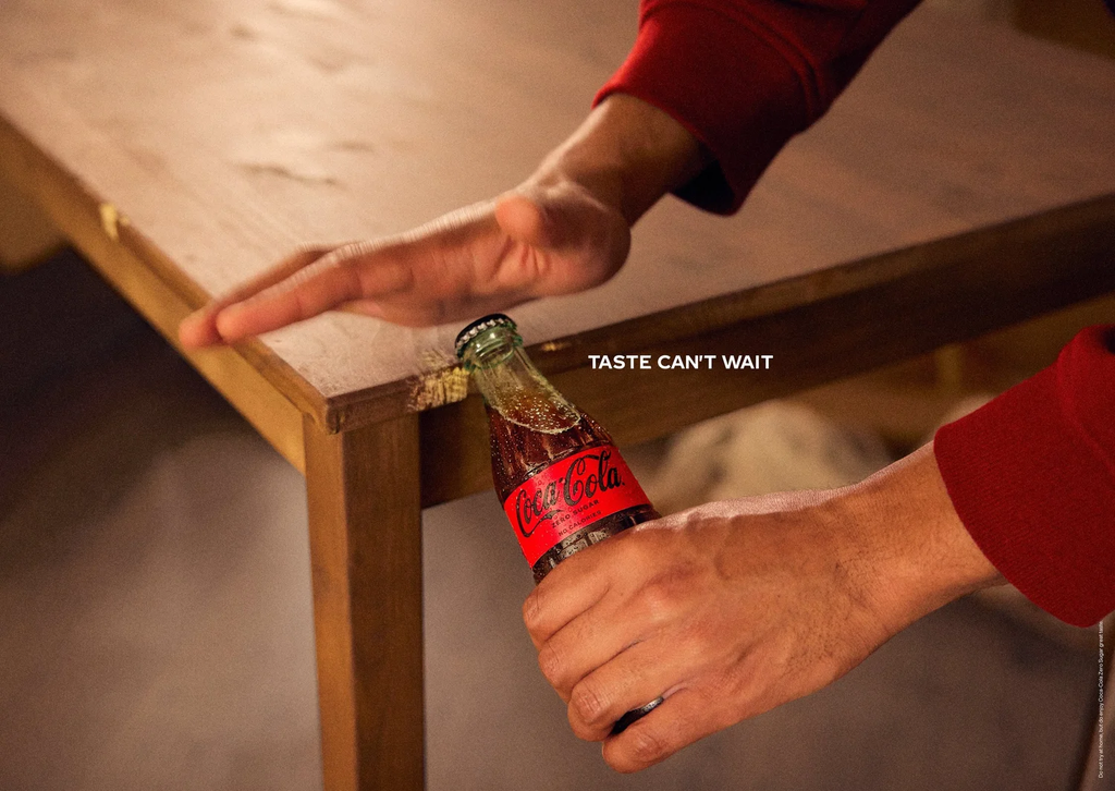
One behaviour connected film and print
The strongest part of “Taste Can’t Wait” is its ability to move between formats without requiring a different idea for each one.
The films show the improvised opening in progress. The print advertisements show the physical evidence left behind. Both arrive at the same conclusion: once someone wants a Coca-Cola, finding the proper tool feels less important than reaching the drink.
No campaign reach, engagement, sales results or award wins have been publicly announced.
However, the work demonstrates how an established brand can find a new advertising idea inside a minor product inconvenience.
The bottle may require an opener, but according to Coca-Cola, taste has no patience.
Credits
“Taste Can’t Wait” was created for The Coca-Cola Company by Ogilvy Spain. Liz Taylor served as Global Chief Creative Officer, Roberto Fara as Global Creative Director, Guillermo Vega as Global Creative Network Lead and Justin Gitterman as Coca-Cola Creative Operations Manager. Gabriel Cavalheiro was Art Director and Gal·la Basora was Copywriter. Jonathan Gibson was Managing Director, María Herranz was Account Director, and Ana Salas and María Ruiz were Account Executives. Alberto van Stokkum handled photography and co-directed the films with Lucas Cambiano under Dimonis. Hogarth and Sal Gorda handled production, with Juanjo Gómez as Executive Producer, Paula Salgado as Producer and Ana Simón as Editor. Gradepunk provided colour finishing.
About the work
Campaign details
Related
More in Print


Popular
Popular posts

More stories