Outdoor
Clock: Mercedes-Benz’s iconic star becomes a symbol of timeless legacy
 By Archit
·
·
5 min read
By Archit
·
·
5 min readAI-assisted
Quick summary
The idea: A student campaign titled Clock transforms the Mercedes-Benz three-pointed star into the centre of an antique timepiece. Created by Sushil Kumar Swamy in Mumbai and published in December 2025, the print and outdoor concept carries the headline Legacy is timeless. Instead of showing vehicles, it compresses nearly 140 years of automotive history into one familiar symbol to connect the brand’s past with its continuing evolution.
The execution: The concept visually integrates the star into a dark, weathered clock face marked with Roman numerals. The campaign uses a restrained black-and-white palette, worn textures, and serif typography, placing the brand line quietly in the corner. The artwork is presented across billboards, bus shelters, and magazines.
Why it matters: The article does not report any audience figures, commercial results, engagement data, or award outcomes for the project.
AI-generated from this article. For complete context and credits, read the full story.
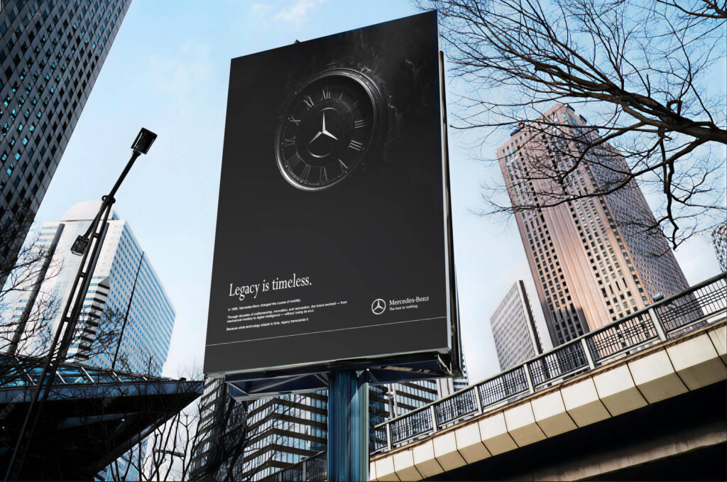
A student campaign titled “Clock” transforms the Mercedes-Benz emblem into the centrepiece of an antique timepiece, using one familiar symbol to connect the brand’s history with its continuing evolution.
Created in Mumbai by Sushil Kumar Swamy, the concept carries the headline “Legacy is timeless.” It presents Mercedes-Benz not through a particular vehicle, feature or model, but through the value accumulated across generations of engineering and design.
Published in December 2025, the project was developed as a print and outdoor campaign. Its four presented assets include the principal artwork and adaptations showing how it could appear across a billboard, a bus shelter and a magazine.
One image carries the complete idea
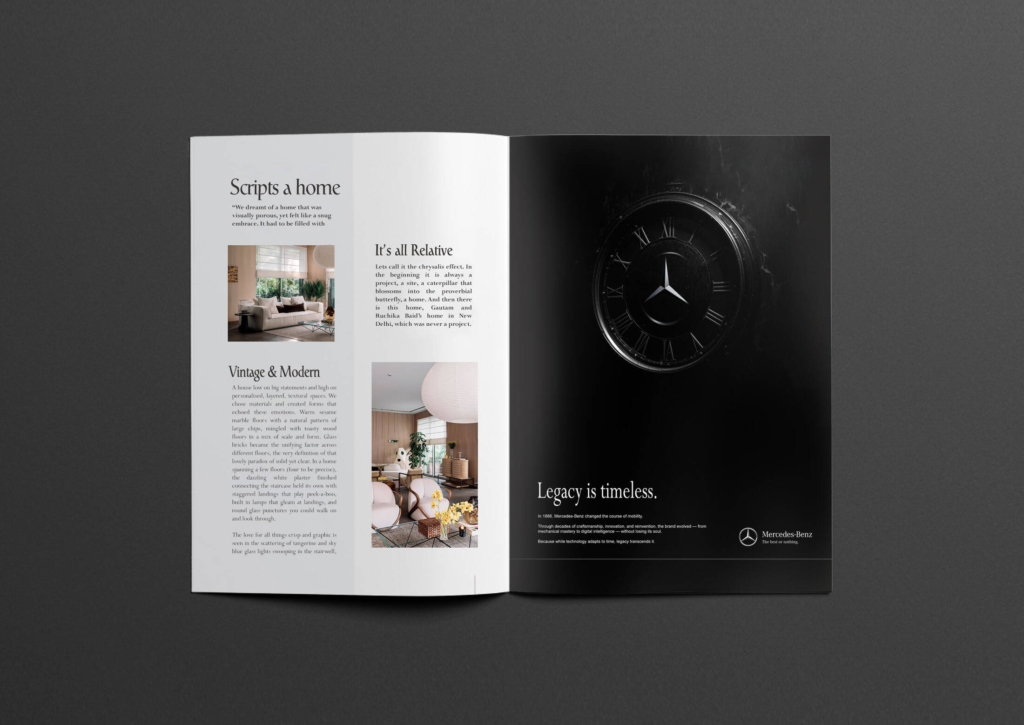
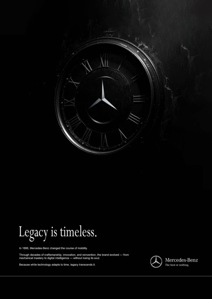
At the centre of the composition is a dark, weathered clock face marked with Roman numerals. The Mercedes-Benz three-pointed star occupies the position normally reserved for the clock’s hands and mechanism.
The relationship is understood almost immediately. A clock represents passing time, while the star represents a brand that has survived and evolved through it.
Instead of showing several historic vehicles or building a complicated visual timeline, the campaign compresses nearly 140 years of automotive history into one object. That simplicity gives the work its strength.
The star becomes part of the clock
The campaign does more than place the Mercedes-Benz logo next to a timepiece. It visually integrates the emblem into the clock itself.
The star appears to belong inside the instrument, almost as though it has always been there. This makes the logo function as both a brand identifier and a metaphor for continuity.
It also gives new meaning to a symbol audiences already recognise. Within the campaign, the three-pointed star no longer represents only a car manufacturer. It becomes the constant at the centre of changing time.
The execution demonstrates how an established identity can generate a fresh idea without being altered beyond recognition.
The copy connects 1886 with the present
The supporting text refers to 1886, the year Carl Benz applied for the patent widely regarded as the birth certificate of the automobile. From that starting point, the copy describes a journey shaped by craftsmanship, innovation and reinvention.
Rather than treating heritage as something fixed in the past, the concept presents it as a foundation for continued progress. Mechanical engineering has gradually been joined by software, digital interfaces, electric mobility and intelligent vehicle systems, but the campaign argues that the brand’s underlying character remains intact.
That thought leads directly to the headline, “Legacy is timeless.” Technology changes with time, but a meaningful legacy can move beyond it.
A restrained visual language supports the message
The campaign uses an almost entirely black-and-white palette. Deep shadows, worn textures and restrained lighting give the clock the appearance of an object preserved through generations.
The serif typography adds a classical tone, while the limited amount of copy keeps the presentation controlled. The Mercedes-Benz identity and “The best or nothing” brand line appear quietly in the lower corner instead of competing with the central visual.
This restraint suits the luxury positioning. The execution does not need bright colours, a vehicle photograph or a loud product claim to attract attention. Recognition comes through the shape of the star and the confidence of the composition.
The concept adapts across print and outdoor
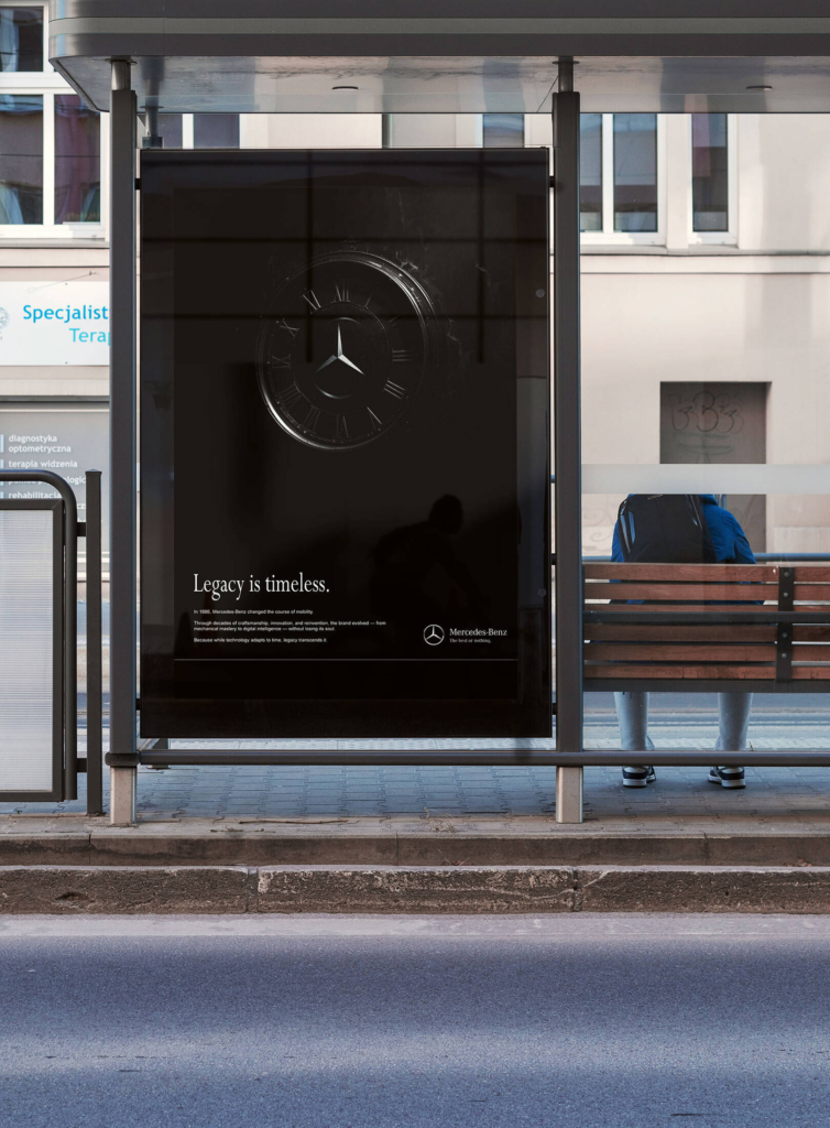
The same artwork is presented across several formats. In the large billboard treatment, the clock dominates the surrounding architecture and can be recognised before the copy is read.
The bus shelter version brings the work closer to street level, giving waiting commuters more time to notice the smaller historical message. The magazine execution benefits from the tactile contrast between the dark advertisement and the editorial page beside it.
These adaptations show that the idea is not dependent on animation, interaction or technology. Its effectiveness comes from a clear visual relationship that can survive changes in scale.
Heritage replaces the conventional product shot
Automotive advertising frequently places the newest vehicle at the centre of the communication. “Clock” takes the opposite route by removing the car completely.
That decision allows the campaign to speak about Mercedes-Benz as an institution rather than promote a single model. The focus moves from short-term product desirability to long-term cultural recognition.
It also invites the audience to mentally supply its own examples of Mercedes-Benz history, from early automobiles and classic luxury models to racing machines, safety innovations and contemporary electric vehicles.
A polished student concept without reported results
“Clock” is identified as a student campaign rather than an officially released Mercedes-Benz commission. Its billboard, bus shelter and magazine appearances should therefore be understood as proposed applications of the idea, not confirmed media placements.
No audience figures, commercial results, engagement data or award outcomes were announced for the project. Its value lies in the clarity of its creative thinking: one famous emblem, one universal object and one concise statement about endurance.
By turning the Mercedes-Benz star into the heart of a clock, the campaign makes the brand’s history feel present rather than nostalgic. Time continues to move, but the symbol at the centre remains unchanged.
Credits
Brand: Mercedes-Benz. Campaign: Clock. Creative concept, art direction and writing: Sushil Kumar Swamy. Location: Mumbai, India. Media: Print and Outdoor. Campaign type: Student concept. Published: December 2025.
Related
More in Outdoor


Popular
Popular posts



More stories