Digital
Instagram’s New Brand Identity: The platform refreshed its wordmark after 10 years
 By Archit
·
·
5 min read
By Archit
·
·
5 min read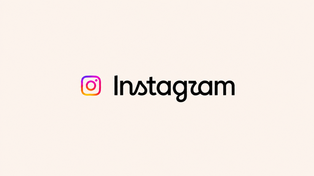
Instagram has changed the handwritten wordmark displayed at the top of its app for the first time in a decade.
The new design retains the platform’s script-based identity but gives the letters a bolder, more compact and more contemporary appearance.
It is important to distinguish the wordmark from Instagram’s app icon.
The familiar camera symbol with its pink, purple, orange and yellow gradient has not been replaced. The update applies to the written “Instagram” name and forms part of a wider redesign of the platform’s brand system.
Instagram did not abandon its existing identity.
It redrew it for the way the platform looks today.
Hundreds of Ideas Led Back to Script
Instagram’s design team explored hundreds of possible directions while developing the new wordmark.
The experiments included all-capital lettering, camera-based concepts and designs based on literal handwriting.
The team eventually returned to script because it believed handwritten forms communicated individuality and personal expression—qualities closely connected with how people use Instagram.
The final wordmark keeps its letters connected but removes some of the looseness and flourishes found in the previous version. The strokes are heavier, the structure is tighter and the overall shape is intended to feel cleaner and more confident.
Jasmine Probst, Instagram’s director of product design, described the new wordmark as bolder and simpler, with unexpected details intended to communicate an individual voice.
The objective was to modernise the brand without making Instagram look unfamiliar.
The Camera Icon Remains Unchanged
The most recognisable part of Instagram’s identity is still the gradient camera icon displayed on phone screens.
That icon remains unchanged.
Instagram’s last major visual transformation came in 2016, when it replaced its detailed brown camera with the simplified gradient symbol used today.
The latest update is more restrained. It changes the wordmark users see inside the app while preserving the symbol most people use to find and open it.
This allows Instagram to introduce a visible change without sacrificing the recognition built around its camera icon.
The Wordmark Is Part of a Larger System
Instagram also updated the visual system surrounding the new wordmark.
The platform’s existing Instagram Sans typeface has been refreshed and joined by two additional type families:
- Instagram Pen: a handwriting-inspired typeface
- Instagram Mono: a custom monospaced typeface
- Instagram Sans: an updated version of the platform’s existing typeface
Together, the three families give Instagram more flexibility across product interfaces, campaigns and communications.
Instagram’s famous gradient remains a central part of the identity, but it will be used more selectively. The updated system also includes changes to motion, layouts and interface applications.
The reduced use of the gradient is intended to create more visual space for photographs, videos, illustrations and other work produced by Instagram’s community.
Instead of making the platform’s branding the most energetic element, the system is designed to let users’ content carry that energy.
A Wordmark Designed Around Individual Expression
Instagram has grown from a photo-sharing application into a platform for video, messaging, shopping, entertainment and creative work.
The new identity attempts to create a system flexible enough to work across those different uses while retaining the warmth of its original script.
According to Meta’s director of brand design, May Hartono, the refreshed system puts community creativity and self-expression at its centre.
Instagram Pen supports that idea through the visual qualities of handwriting. Instagram Mono provides a contrasting technical voice, while Instagram Sans continues to handle the platform’s functional communication.
The three typefaces allow Instagram to move between personal, expressive and practical applications without leaving the same visual family.
Some Users Read the Name as “Instagzam”
The redesign generated an immediate and mixed response after Instagram head Adam Mosseri revealed it on Instagram and Threads.
Much of the discussion focused on the stylised letters near the end of the wordmark. The shape of the new “r,” positioned beside the preceding “g,” led some users to joke that the name appeared to read “Instagzam.”
Others questioned the legibility of the new letters, while supporters described the update as cleaner and more modern.
The response demonstrates the difficulty of changing a visual identity used by billions of people. Even a relatively small typographic adjustment becomes noticeable when audiences have spent ten years looking at the previous design.
Instagram’s established recognition may help the wordmark survive occasional misreading. Users already know which platform they have opened, meaning the lettering can function as a familiar shape as well as readable text.
The New Identity Will Roll Out Gradually
Instagram began introducing the refreshed wordmark globally on August 13, 2026.
The wider brand system will appear across the platform throughout 2026 and beyond. This includes the updated typography, subtler gradient applications, refreshed motion and new layout principles.
Meta has not published research showing how the new wordmark affects recognition, accessibility or brand perception.
The early launch produced thousands of comments and substantial design discussion, but it remains too soon to assess how users will respond after repeated exposure.
Why the Redesign Matters
Instagram could have replaced its identity with something entirely new.
Instead, it returned to the visual element that has followed the platform throughout its history: handwritten script.
The result is an evolution rather than a reinvention.
The camera icon preserves recognition. The redrawn wordmark introduces change. The expanded type system gives the brand more ways to communicate, while the restrained gradient gives users’ content more space.
The most debated letter may be the “r.”
The larger change is the system built around it.
Credits
Project: New Instagram Brand Identity
Brand: Instagram
Parent company: Meta
Design: Instagram and Design at Meta
Director of Product Design, Instagram: Jasmine Probst
Director of Brand Design, Meta: May Hartono
Launch: August 13, 2026
Rollout: Global, throughout 2026 and beyond
Related
More in Digital




Popular
Popular posts


More stories