Outdoor
Make the Logo Bigger: Canva turned design feedback into billboards
 By Archit
·
·
5 min read
By Archit
·
·
5 min read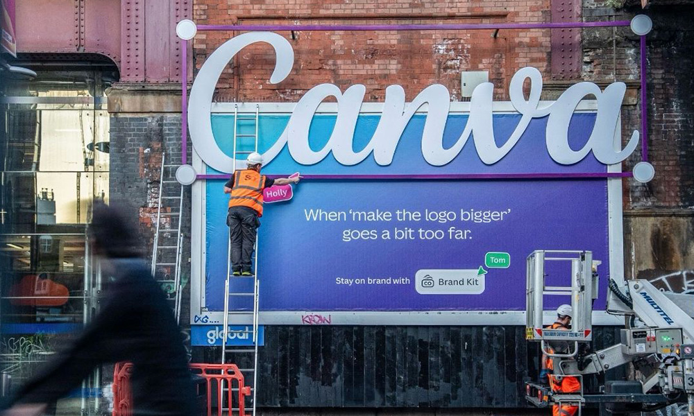
In June 2025, Canva took over 14 billboards at London Waterloo and turned familiar creative problems into outdoor ads. Logos escaped their frames, the wrong aspect ratio became the artwork and a real e-bike appeared to have been dragged onto a poster. Stink Studios created Make the Logo Bigger with Canva’s in-house marketing team.
The campaign did not explain what Canva could do.
It let the billboards demonstrate it.
Creative frustration supplied the ideas
Anyone who regularly makes presentations, social posts or advertising has probably experienced a last-minute change.
The logo needs to be bigger. A landscape design suddenly needs to become vertical. Someone wants the background removed. Meanwhile, a brainstorm fills with comments from several people.
Canva turned those moments into the campaign.
The most direct execution answered the familiar request to “make the logo bigger.” A huge Canva logo became too large for the advertising space and physically broke beyond the billboard frame.
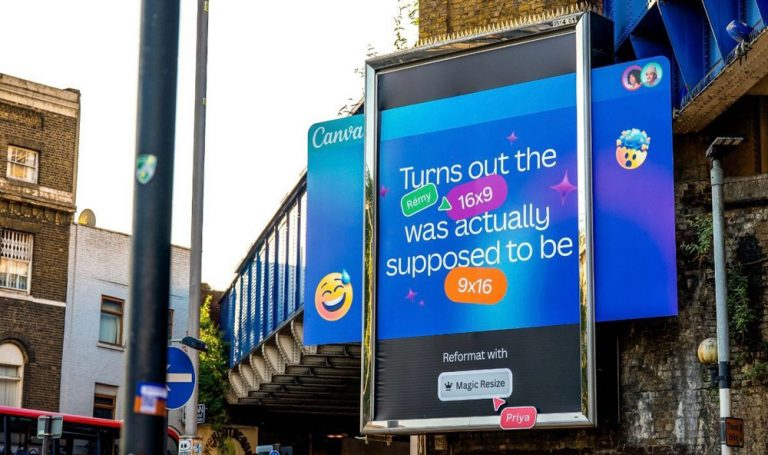
Another execution deliberately placed a landscape design into the wrong vertical format with the line about discovering that 16×9 was supposed to be 9×16.
The mistake introduced Magic Resize, Canva’s tool for adapting a design to another format. Instead of showing the feature through screenshots or instructions, the billboard displayed the problem it was designed to solve.
That structure continued across the takeover.
First came something a designer recognised.
Then Canva supplied the answer.
The tools escaped the screen
Some executions moved beyond printed jokes.
To demonstrate drag and drop, the campaign attached a 3D replica of a Forest e-bike to the outdoor structure. It appeared as though someone had dragged the object from Canva’s interface and dropped it directly onto the billboard.
Background Remover received another physical interpretation.
Parts of the advertising space appeared to disappear, revealing or recreating the wall and structure behind the poster. The effect turned digital transparency into something visible in the real world.
A Canva Whiteboard execution took a different route.
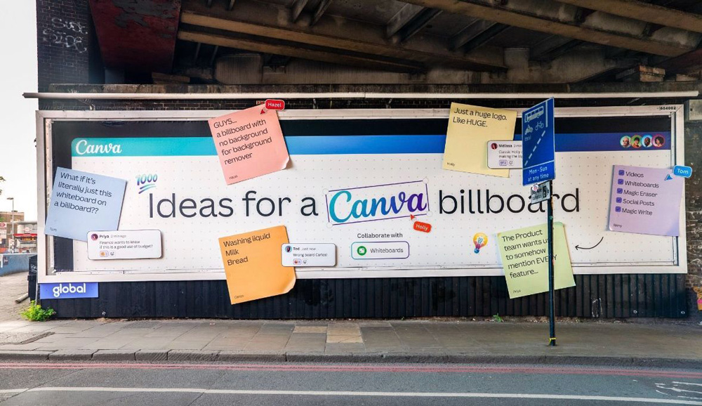
Sticky notes covered the board with loose ideas and comments, including deliberately ordinary suggestions such as a huge logo and shopping-list items. The messy surface recreated the stage before a polished design exists.
Another execution mapped the creative journey from the arrival of a brief through rounds of work and feedback towards the final result.
Together, the billboards behaved like pieces of the Canva interface placed around Waterloo.
The product demonstration and the outdoor idea became the same thing.
Waterloo became one large workspace
The takeover began on 16 June and occupied all 14 billboards in the Waterloo gallery. Media was handled by OMD, while Talon and Grand Visual produced the special builds.
Using the entire space allowed individual posters to speak to one another.
The whiteboard could reference ideas appearing elsewhere in the station. A strange layout on one board made more sense after someone encountered another Canva joke further along the route.
As a result, commuters did not simply pass the same campaign artwork several times. They moved through different parts of the design process.
The Waterloo work followed an earlier London outdoor phase timed around SXSW London. That activity included an Old Street installation animated with hundreds of collaborative cursors to demonstrate Canva’s real-time collaboration features. Digital work on YouTube and LinkedIn supported the outdoor campaign through the summer.
The same principle connected both phases.
Canva took something people normally experienced inside its software and made it physical enough to notice from across the street.
The Impact
The special-build executions later generated more than 40,000 social engagements, according to campaign reporting. The work was also widely photographed and shared as people recognised the design jokes outside Waterloo.
That reaction suited the campaign because the work had been built around shared experiences.
Someone did not need to be a professional designer to understand a request for a larger logo or the frustration of discovering that a design had been made in the wrong dimensions.
However, people working in marketing and design could recognise another layer.
These were the messages, corrections and workflow problems they encountered regularly.
Canva used that familiarity to make product advertising feel closer to an inside joke.
Why It Still Works
Make the Logo Bigger demonstrated software without putting software screenshots across every billboard.
Magic Resize became a badly formatted ad. Background Remover made part of the poster disappear. Drag and drop placed a bicycle on the structure. Meanwhile, collaborative brainstorming became a wall of unfinished thoughts.
Each tool changed the media carrying its advertisement.
That gave Canva a way to talk about practical features while keeping the work visual enough for outdoor.
The campaign also understood something about creative work itself.
The finished design may look effortless.
Getting there rarely does.
Canva took the mess, revisions and misunderstood briefs that usually stay behind the final artwork and made them the part everyone could see.
Credits
Make the Logo Bigger (2025) — Canva, United Kingdom. Creative: Stink Studios and Canva in-house marketing team. Canva Creative Director Europe: Tom Carey. Canva Marketing Director Europe: Melissa Cosneau. Stink Studios Executive Creative Director: Cameron Temple. Media: OMD. Special build and production: Talon and Grand Visual. Image credit: Simon Knox. Media: outdoor, YouTube and LinkedIn.
Related
More in Outdoor


Popular
Popular posts

More stories