Outdoor
The Sign: Coca-Cola turned its white ribbon into directions to recycling bins
 By Archit
·
·
4 min read
By Archit
·
·
4 min readAI-assisted
Quick summary
In 2019, Coca-Cola and Publicis Italy launched an outdoor campaign across Central and Eastern Europe that transformed the brand’s 1969 white ribbon into a directional hand pointing toward nearby recycling bins. Titled The Sign, the campaign used billboards for public wayfinding alongside the instruction to open, taste, and recycle. Because every placement depended on the exact surroundings, media planning became part of the creative process. If a suitable bin was missing, a new one could be installed, and the ribbon's angle was adjusted so the board, pedestrian route, and disposal point functioned together.
The campaign also appeared at the Coca-Cola-sponsored Happy Energy Tour in Bulgaria, where temporary layouts often make bins difficult to find. Using large red boards and clear directions, the effort helped guide visitors at the moment they held an empty can. Some executions included a statistic noting that 91 percent of plastic was un-recycled, alongside the brand's commitment to fully recyclable packaging by 2025. During the Bulgarian festival, 85 percent of discarded cans were reportedly placed in the correct bins, demonstrating how visibility and convenience could encourage practical action without relying on complicated systems.
AI-generated from this article. For complete context and credits, read the full story.
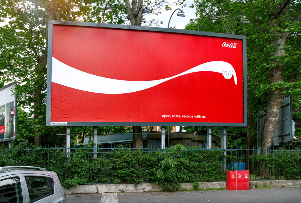
In 2019, Coca-Cola gave its familiar white ribbon a hand and used it to point people towards recycling bins.
Created by Publicis Italy, The Sign transformed billboards across Central and Eastern Europe into working pieces of public wayfinding. Every placement directed people towards a real recycling bin nearby, supported by the simple instruction, “Open, taste, recycle with us.”
The campaign also appeared at Coca-Cola’s Happy Energy Tour in Bulgaria, where 85 percent of the brand’s cans were reportedly placed in the correct recycling bins.
Every billboard pointed somewhere real
The campaign depended on its surroundings. Before placing a billboard, the team checked whether the white ribbon could point clearly towards an existing recycling bin.
When a suitable bin was unavailable, Coca-Cola could install a new one. The angle of the ribbon and illustrated hand was then adjusted for that particular location.
As a result, each billboard had a practical relationship with the street around it. A version pointing left could not simply be moved to a location where the bin was on the right.
This made media planning part of the creative process. The team was not only looking for prominent advertising space. It needed locations where the board, pedestrian route and recycling point could function together.
The billboard helped people find the bin at the exact moment they might be holding an empty bottle or can.
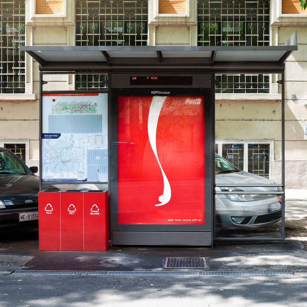
The white ribbon became a wayfinding system
Coca-Cola introduced the white ribbon into its visual identity in 1969. Over time, the flowing shape became one of the brand’s most distinctive design elements.
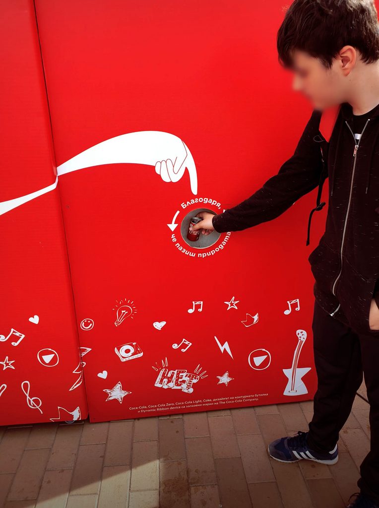
For The Sign, the ribbon stretched beyond the Coca-Cola script and formed an arm, hand and pointing finger. The red background remained familiar, allowing the altered ribbon to be recognised quickly from a distance.
The campaign did not need a detailed explanation. The direction of the finger, the nearby bin and the short instruction completed the message.
Furthermore, the transformation kept the design connected to the product. Coca-Cola was not adding a generic recycling arrow to its advertising. It was giving an existing piece of its visual identity a useful job.
Some executions also included a statistic stating that 91 percent of plastic was not recycled, alongside Coca-Cola’s commitment at the time to make its packaging fully recyclable by 2025.
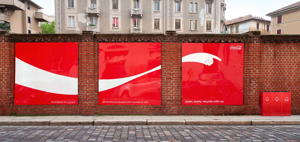
The festival became an early test
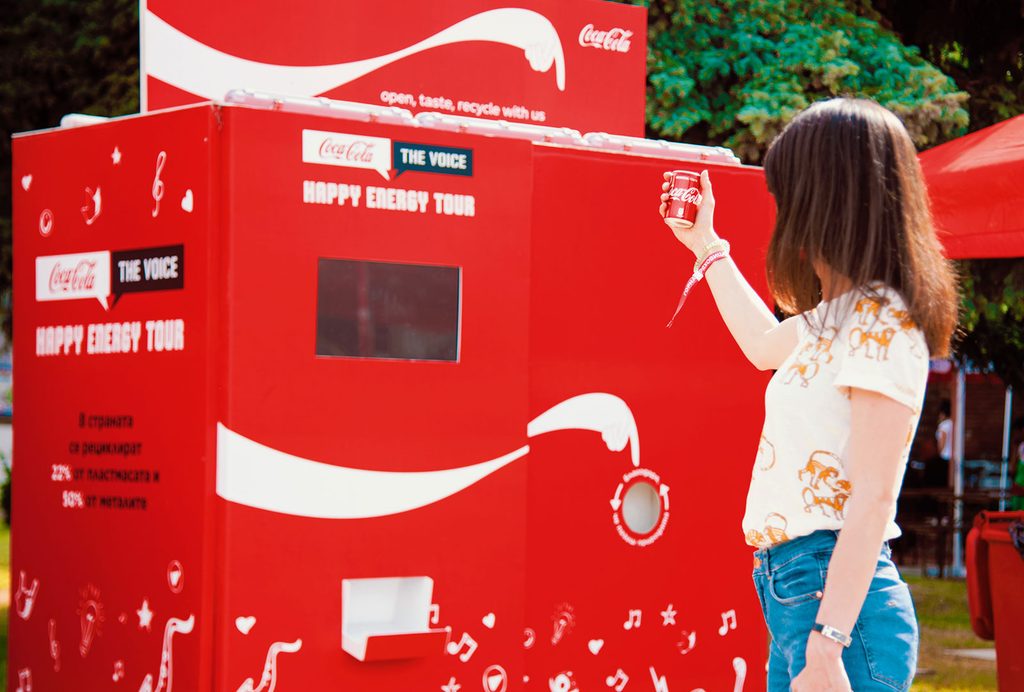
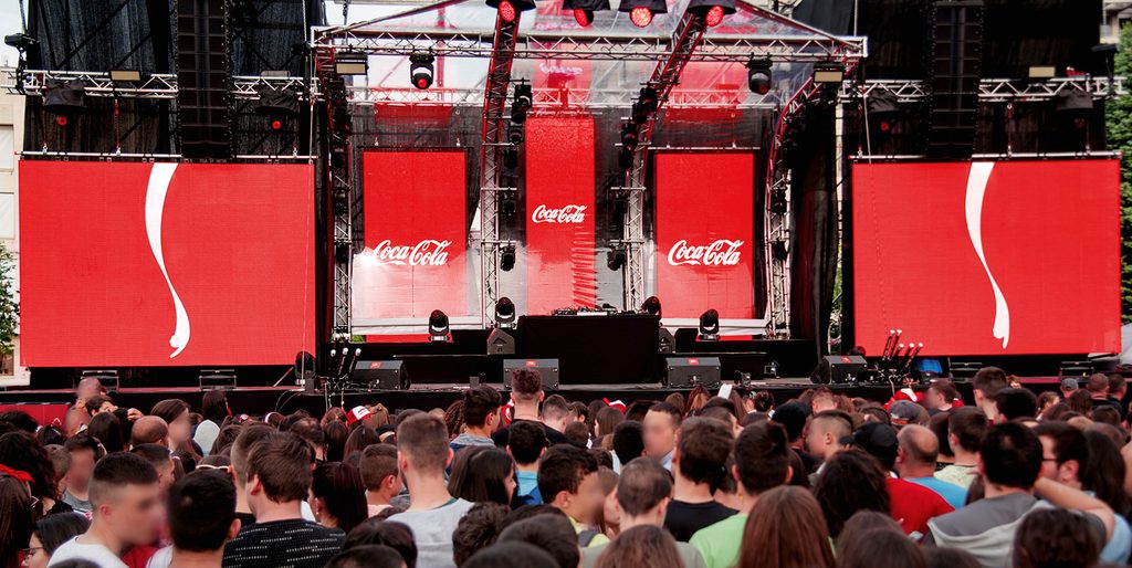
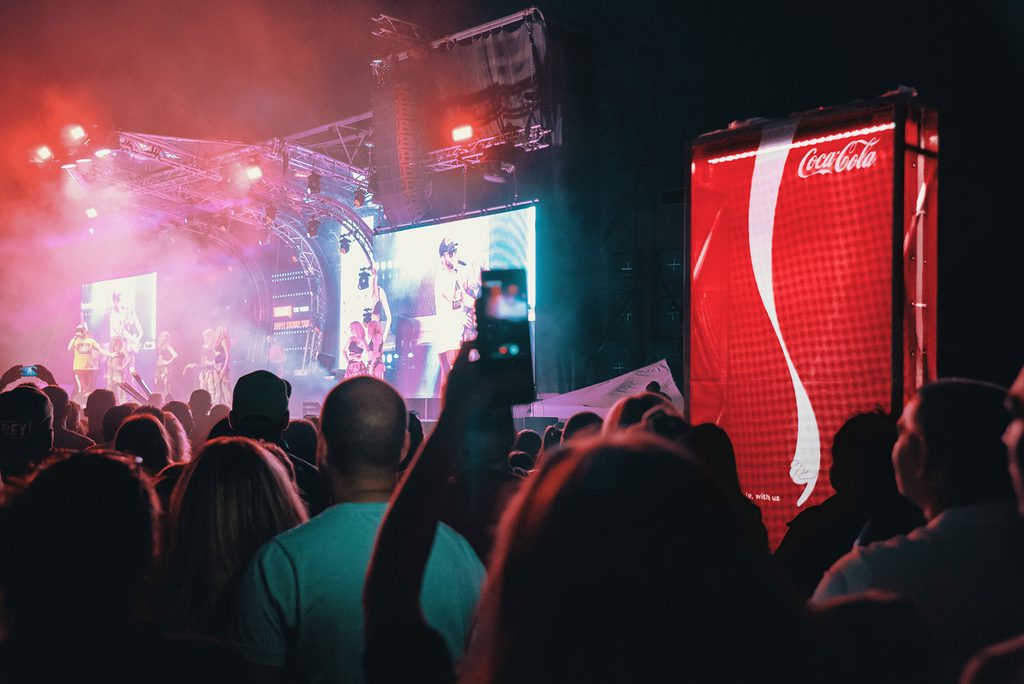
The campaign appeared during the Happy Energy Tour, a Coca-Cola-sponsored music event travelling across Bulgaria.
Festivals create a concentrated waste problem. Thousands of people buy drinks within a short period, while temporary layouts and crowded spaces can make suitable bins difficult to find.
The Sign used large red boards to make the correct disposal points visible across the event. Meanwhile, the illustrated hands gave visitors a clear direction without requiring them to stop and read a long environmental message.
The campaign was informed by research stating that source-separated recycling could increase by 141 percent when the correct bins were easier to locate.
During the Bulgarian event, 85 percent of discarded Coca-Cola cans were reportedly placed in the correct recycling bins. That early result suggested that visibility and convenience could change behaviour without adding a complicated system.
Why it still works
The Sign connected the message, media and requested action in one physical space. People saw the recycling reminder beside the place where they could immediately follow it.
However, the campaign did not pretend that a billboard could solve plastic waste. Its focus was narrower. It addressed one practical barrier by helping people find the right bin.
The placement also gave the billboard a reason to exist beyond visibility. Moving it away from the recycling point would weaken the idea, which meant the location was not simply media space. It was part of the design.
Finally, Coca-Cola used an asset people already associated with the brand. The white ribbon remained recognisable while becoming directional, allowing a familiar piece of packaging design to guide a small public action.
The result was a billboard that did more than ask people to recycle. It showed them exactly where to do it.
Credits
The Sign (2019), Coca-Cola, Central and Eastern Europe. Agency, Publicis Italy. Global Chief Creative Officer at Publicis Communications Worldwide, Bruno Bertelli. Chief Creative Officer at Publicis Italy, Cristiana Boccassini. Executive Creative Directors, Davide Boscacci and Jorg Riommi. Art Director, Andrea Raia. Copywriter, Matteo Gatto. Illustrator, Davide Barco. Global Client Service Director, Lorenza Montorfano. Account Director, Marcia Carneiro. CEE Portfolio and Growth Director, Romain Maillard. CEE IMC Director, Dmitry Muzychenko. CEE Content Excellence Director, Monica Alvarez. CEE Content Excellence Manager, Desirèe Ferrari.
About the work
Campaign details
Related
More in Outdoor

Popular
Popular posts


More stories