Editor's Pick
StarMark Glass: Heineken turned condensation into a logo that stays on the table
 By Archit
·
·
5 min read
By Archit
·
·
5 min readAI-assisted
Quick summary
Heineken has introduced a new global glassware design, the StarMark glass, which uses natural condensation to leave a temporary imprint of the brand's five-pointed star on tables. Developed by Dutch industrial design studio npk alongside Design Bridge and Partners, the vessel features a star-shaped geometry extending from the base through five pronounced facets that also provide grip, stability and proper head retention.
Following an initial launch in Irish pubs and bars in April 2025 supported by the Reach for the Star campaign, the design has begun rolling out globally as Heineken's standard beer glass. The project, which required overcoming significant manufacturing challenges to produce the complex geometry at scale, has received industry recognition, including Best in Show at the 2026 FAB Awards.
AI-generated from this article. For complete context and credits, read the full story.
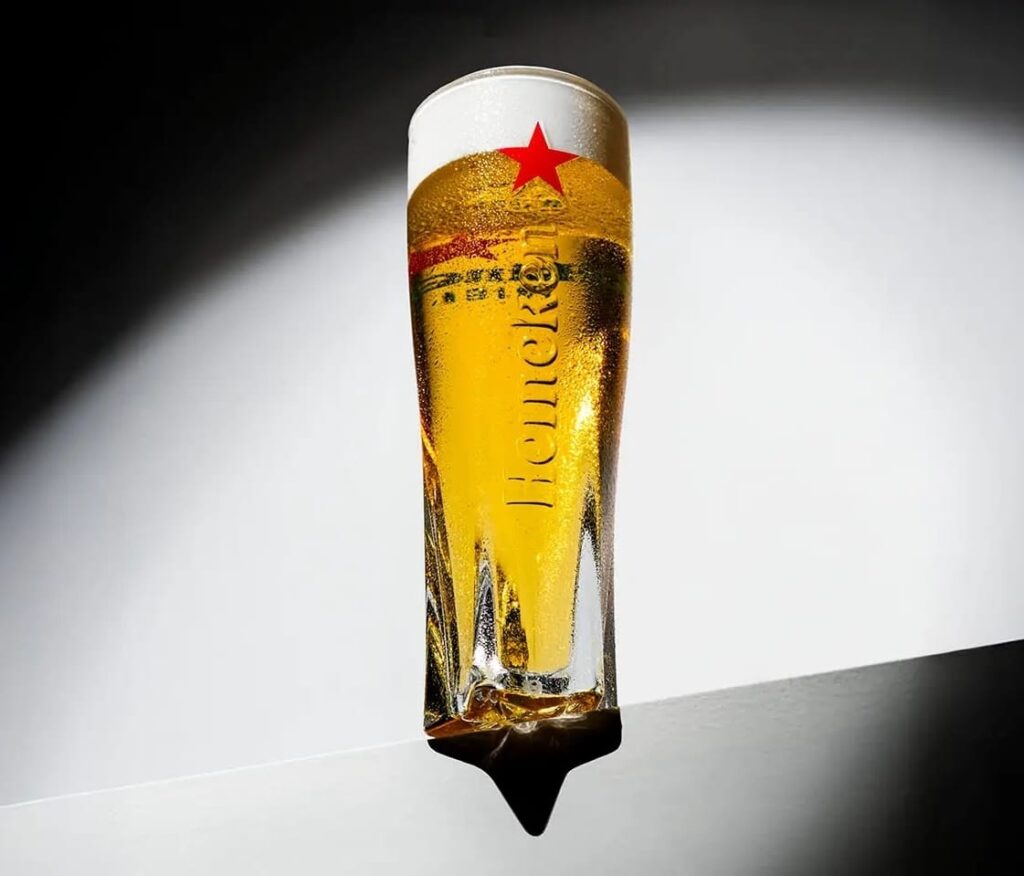
Heineken has transformed one of the most ordinary consequences of drinking a cold beer into a subtle piece of branding.
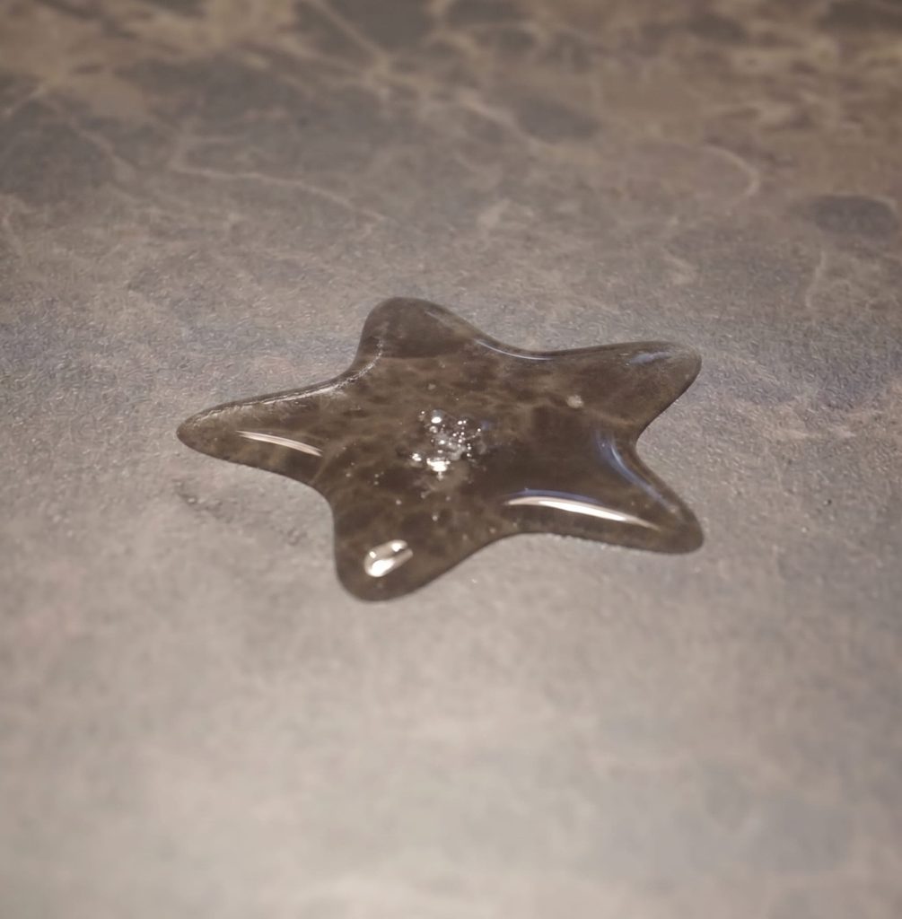
The brand’s StarMark glass features a sculpted five-pointed base that collects condensation around its edges. When the drinker lifts the glass, the moisture leaves an outline of Heineken’s star on the table.
The effect requires no ink, electronics or projection. A cold glass, a flat surface and an action people already perform are enough to produce the temporary logo.
The star shapes the entire glass
The star is not simply printed underneath the glass.
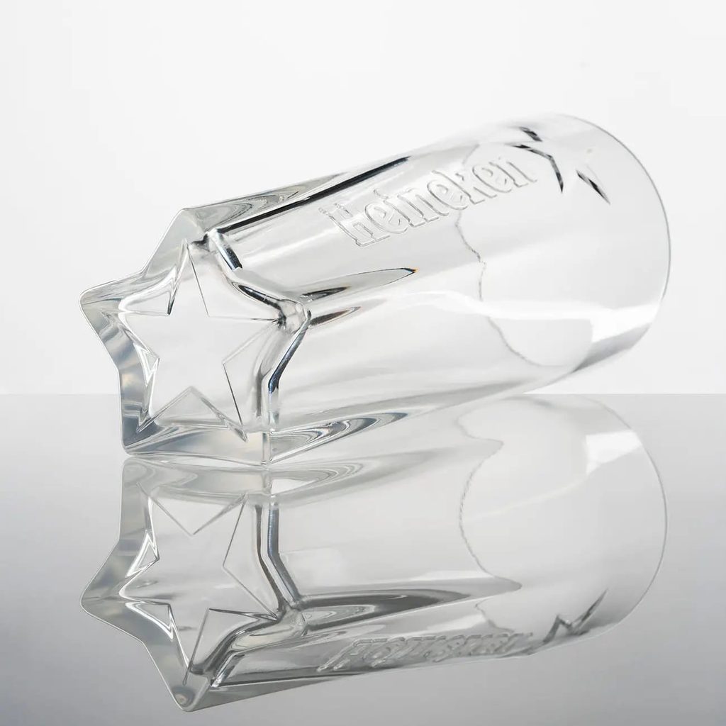
Its geometry begins at the base and continues upwards through five pronounced facets that shape the body of the vessel. Viewed from above, the structure resembles Heineken’s familiar five-pointed symbol. From the side, the same lines give the glass a distinctive silhouette and grip.
This makes the brand recognisable even without relying entirely on its red star, green colour or wordmark.
The design gives an established asset several functions. It influences how the glass looks, how it feels in the hand and what it leaves behind after being lifted.
Condensation becomes temporary media
Cold drinks normally produce wet rings that carry no meaning. StarMark reorganises that moisture into a recognisable brand symbol.
Every time someone places the glass down and picks it up, another star can appear. The table becomes a temporary communication surface created by the product itself.
Because the mark is formed by condensation, each impression eventually evaporates. That temporary quality makes the detail feel more like a discovery than a conventional logo placement.
It can also generate conversation. One person notices the star, shows it to someone else and repeats the action to understand how it appeared.
The idea succeeds by redesigning an existing behaviour instead of asking customers to learn a new one.
The brief was to create a desirable object
Heineken asked Dutch industrial design studio npk to create a glass that people would want to take home after seeing it.
Working with Heineken and Design Bridge and Partners, the studio explored how the star could become part of the object rather than another graphic added to its surface.
Hand sketches were developed into digital renderings before the team created highly realistic plexiglass models. Test panels then assessed the concepts for grip, stability, pouring and drinking comfort.
The star-shaped proposal received an enthusiastic response from users, but translating it into mass-produced glassware created a larger challenge.
Manufacturers initially considered it impossible
The geometry required to carry a star from the base through the full height of the glass was difficult to reproduce at scale.
Glass manufacturers initially questioned whether the proposed structure could be manufactured consistently. Npk worked on the mould engineering needed to preserve the five-pointed form while meeting the practical demands of high-volume production.
The completed glass was designed to do more than create visual impact. Its dimensions and shape are intended to support aroma, presentation and head retention, while the faceted body provides a comfortable grip for drinkers and bar staff.
Separate versions were developed for Heineken Original and Heineken 0.0, allowing the design system to work across both products.
Ireland received the first glasses
Heineken introduced StarMark in Irish pubs and bars during April 2025, nine years after its previous major glassware launch.
That nine-year figure refers to the interval between Heineken glassware introductions, rather than nine years spent developing StarMark.
The rollout was teased through a campaign titled “Reach for the Star.” Giant stars appeared in Irish locations containing “glass” in their names, including Glasson, Terryglass, Baltinglass and Glasnevin.
People who photographed the stars could show their images at participating venues and receive one of the first pints served in the new glass. Outdoor media, digital placements, creators and publishing partnerships supported the launch.
The glass later reached Northern Ireland, where more than 5,000 units were distributed during the initial rollout.
A local launch became a global standard
StarMark is now becoming Heineken’s standard beer glass across its global markets.
The Netherlands is the exception, with a separate design being developed for the brand’s home market.
The worldwide rollout gives Heineken a consistent physical identity in pubs and bars where many competing brands appear together. Instead of depending only on taps, coasters or refrigerators, the glass makes the serve itself part of the brand system.
Its strongest feature appears after the most obvious piece of branding has been removed. Lifting the glass reveals another Heineken symbol underneath it.
The design earned industry recognition
StarMark received Best in Show at the 2026 FAB Awards and collected Gold awards for Packaging Design and Collateral and Point of Sale.
The recognition reflects how the project connects brand identity, industrial design and everyday behaviour through one physical detail.
Heineken did not create a new symbol or add another promotional surface. It gave its existing star a structural role and allowed water to reproduce it.
The result shows how packaging and serving objects can continue communicating after they have been picked up, moved or placed elsewhere. StarMark does not merely carry the Heineken identity. It performs it.
Credits
StarMark was created for Heineken by Dutch industrial design studio npk in collaboration with Design Bridge and Partners Amsterdam. Npk developed the glass’s physical form, prototypes and production engineering, while Design Bridge and Partners worked on the wider two-dimensional identity and brand expression. The glass launched first in Ireland through the “Reach for the Star” campaign before beginning its international rollout.
About the work
Campaign details
Related
More in Editor's Pick


Popular
Popular posts


More stories