Outdoor
Passport Stamps: Land Rover built the Defender from border crossings
 By Archit
·
·
4 min read
By Archit
·
·
4 min readAI-assisted
Quick summary
The idea: RKCR/Y&R London created the Passport Stamps campaign in 2011 to showcase the Land Rover Defender's readiness for difficult global journeys by turning an open passport into a visual record of exploration.
The execution: Photographer Carl Warner and typographers Lee Aldridge and SiD crafted a detailed collage of authentic, uneven border stamps across worn passport pages. Up close, viewers see individual arrival and departure marks, which resolve from a distance into the Defender's instantly recognizable silhouette.
Why it matters: The campaign proved that the Defender's distinctive profile could carry the brand's message without direct vehicle photography. It earned widespread industry recognition, winning top honours including a D&AD Wood Pencil, Cannes Silver Press Lion, and an Epica d'Or.
AI-generated from this article. For complete context and credits, read the full story.
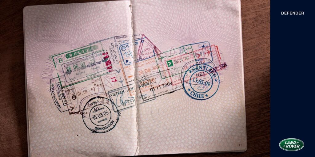
In 2011, Land Rover placed an open passport at the centre of an ad for the Defender. Across its worn pages, arrival and departure stamps form the outline of the famous four-wheel drive. Its roofline, bonnet, wheels and rear body emerge from marks collected around the world.
RKCR/Y&R London created Passport Stamps to express the Defender’s readiness for difficult journeys. The image replaces the standard vehicle photograph with a record of travel. In turn, every stamp becomes evidence of somewhere the Defender could take you.
The Passport Became the Landscape
Adventure advertising often depends on spectacular locations. However, Passport Stamps brings every destination into one compact object.
The open passport suggests borders crossed, distances covered and journeys accumulated over time. Different shapes, dates and ink impressions give the pages a sense of movement. Meanwhile, the countries remain individual pieces of a much larger picture.
From close range, the viewer sees a dense collection of official marks. From further away, those marks resolve into a Defender. That change in perception gives the poster its immediate reward.
The environment is therefore present even though it never appears directly. Mountains, deserts and remote roads exist in the viewer’s imagination. The passport supplies the evidence, while the Defender’s outline connects those places into one continuous journey.
Recognition Made the Idea Possible
The concept depends on the Defender being recognisable from its shape alone.
Its long, flat roof and upright body create a distinctive profile. As a result, the vehicle can be reduced to a loose field of stamps and still remain identifiable. The silhouette becomes a brand asset in its own right.
That recognition also lets the image communicate before the audience reaches the copy or logo. First comes the passport. Then comes the vehicle. Finally, the two ideas meet in a clear promise about capability and exploration.
According to the D&AD archive, the collage was designed to suggest that the Defender was ready for its next adventure regardless of the environment. The execution makes that thought tangible. Each border crossing appears to add another piece to the vehicle.
The Craft Sits Inside the Imperfection
D&AD describes the image as an expertly crafted collage. That distinction matters because the stamps have been arranged to preserve two impressions at once.
They need to feel like authentic passport marks. Therefore, they remain uneven, layered and occasionally faded. At the same time, their placement must describe the Defender with enough precision to make the silhouette readable.
The passport’s central fold also becomes part of the composition. The vehicle stretches across both pages, which gives the design width and helps the image feel naturally embedded in the document.
Photographer Carl Warner created the final image, while typographers Lee Aldridge and SiD worked on the lettering and stamp details. Their craft gives the collage its lived-in texture. The result feels accumulated rather than mechanically assembled, even though every element serves a carefully controlled shape.
Awards Followed the Single Image
The campaign appeared in targeted press and was also recognised in outdoor categories. Its public record is strongest in creative awards.
D&AD records Passport Stamps as a 2012 Wood Pencil in Press & Outdoor. The work also received a Silver Press Lion at Cannes, an Epica d’Or for Outdoor, a One Show Silver and a Clio Bronze for posters. These honours are listed in the campaign’s advertising archive entry.
That spread across press and outdoor reflects the portability of the idea. The passport provides fine detail for close viewing, while the Defender silhouette remains clear at poster scale.
The Silhouette Carries the Claim
Passport Stamps turns durability and reach into a visual record of destinations. Every mark represents another border. Together, those marks become the vehicle built to cross them.
The image succeeds because its parts remain simple. A passport communicates travel. A Defender communicates endurance. Once joined, they produce an idea that can be understood almost as quickly as the silhouette appears.
Credits
Brand: Land Rover
Model: Defender
Campaign: Passport Stamps
Agency: RKCR/Y&R London
Executive Creative Director: Mark Roalfe
Art Director: Tim Brookes
Copywriter: Phil Forster
Photographer: Carl Warner
Typographers: Lee Aldridge and SiD
Production: Ali Power
Account Director: Glynn Euston
National Communications Manager: Les Knight
Market: United Kingdom
Release: May 2011
Related
More in Outdoor


Popular
Popular posts


More stories