Outdoor
Follow the Arches: McDonald’s turned its logo into road directions
 By Archit
·
·
3 min read
By Archit
·
·
3 min readAI-assisted
Quick summary
In February 2018, McDonald’s Canada and agency Cossette launched "Follow the Arches," an outdoor campaign in Toronto that transformed sections of the brand's iconic logo into functional road directions. Designed to replace an inconsistent system of local restaurant signage, the campaign used cropped yellow segments of the Golden Arches against a red background to resemble directional arrows. Four roadside billboards featured minimal copy and specific navigational guidance, such as "On your left," "Next exit," and "Just missed us."
By relying entirely on the familiar curves, colors, and thickness of the existing brand asset, the minimalist displays delivered quick messages to drivers without including photographs, product prices, or restaurant buildings. The creative transformation successfully united advertising and navigation, earning the Outdoor Grand Prix at the 2018 Cannes Lions.
AI-generated from this article. For complete context and credits, read the full story.
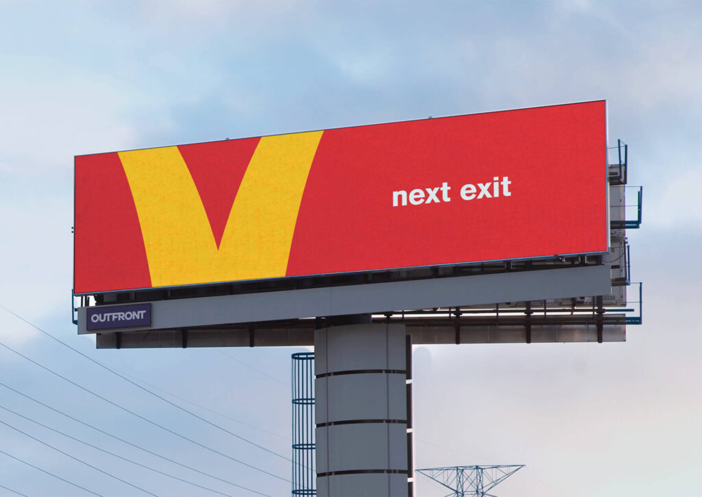
McDonald’s converted pieces of its Golden Arches into arrows that directed drivers towards nearby restaurants.
Created by Cossette, “Follow the Arches” launched in Toronto, Canada, in February 2018. The outdoor campaign used cropped sections of the famous “M” to communicate directions such as “On your left,” “Next exit” and “Just missed us.”
Each billboard used McDonald’s familiar red and yellow colours, a small amount of copy and only the part of the logo needed to point drivers in the correct direction.
Different road signs created an inconsistent system
McDonald’s restaurants across Canada used various signs to help drivers find nearby locations. However, their designs and messages were not always consistent.
Cossette saw an opportunity to create a single wayfinding system that could work across different locations and directions. The solution was already present in one of the world’s most recognisable logos.
When sections of the Golden Arches were isolated and cropped, their curves resembled directional arrows. Different sections could point left, right or towards an approaching exit.
This allowed McDonald’s to provide practical directions while keeping the communication unmistakably connected to the brand.
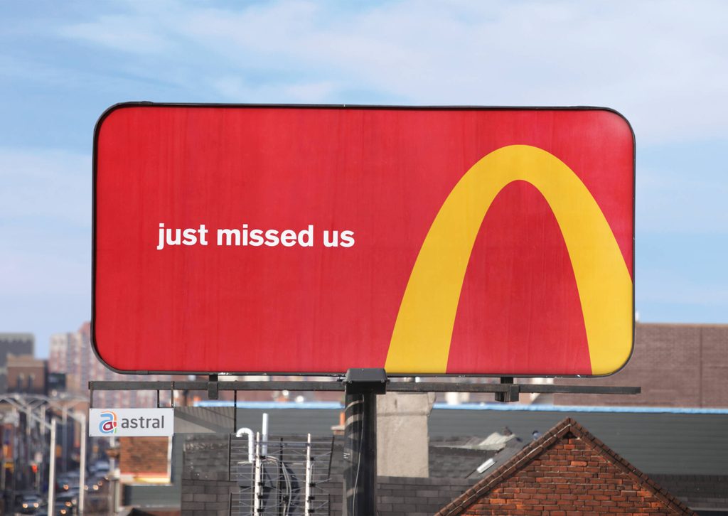
Cropped arches became directional arrows
The campaign removed everything that was not necessary. There were no photographs of burgers, restaurant buildings or product prices.
Instead, each billboard displayed a large yellow section of the Golden Arches against a red background. A short line of text clarified where drivers needed to go.
One execution used a cropped arch to point left beside the message “On your left.” Another directed drivers towards the “Next exit.” A third used the line “Just missed us” after motorists had passed a restaurant.
The logo remained recognisable even when most of it was missing. Its colour, thickness and familiar curve carried enough visual information for drivers to identify McDonald’s quickly.
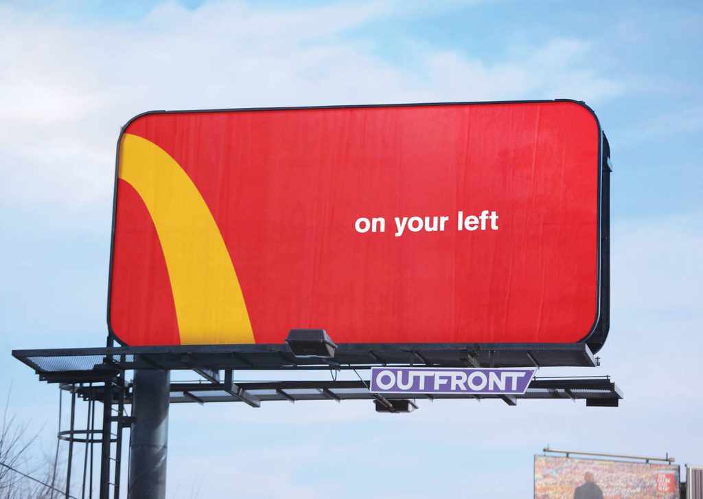
Four billboards demonstrated the idea
The original Toronto campaign consisted of four roadside billboards, including three static displays and one digital placement.
Each location required a different directional message. However, the same basic visual system could adapt to all of them.
The campaign therefore worked as both advertising and navigation. It reminded people about McDonald’s while giving them useful information about where to find the nearest restaurant.
Its minimal design was also suited to the roadside environment. Drivers had only a few seconds to notice and understand each message, so the cropped arch and short copy delivered the information without unnecessary detail.
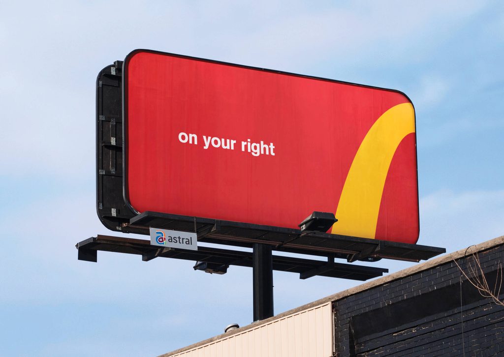
Recognition came from using an existing asset differently
“Follow the Arches” showed how a familiar brand element could perform a practical function without being redesigned.
McDonald’s did not need to create a new symbol for its directional signs. Cossette found arrows inside the existing logo by changing the crop and positioning.
The campaign won the Outdoor Grand Prix at Cannes Lions in 2018. Its recognition came from a simple transformation that connected brand identity, location and consumer need.
By allowing the Golden Arches to become the directions, McDonald’s made the instruction “Follow the Arches” feel both literal and familiar.
Credits
McDonald’s Restaurants of Canada was the client, with Cossette Canada as the creative agency. Carlos Moreno and Peter Ignazi served as global chief creative officers, while Craig McIntosh, Jaimes Zentil and Guy Moore were creative directors. Spencer Dingle and David Théroux were art directors, Jordan Hamer and Philippe Brassard were copywriters, Oleg Portnoy was senior designer and Corey Way was designer. OMD handled media, and Novus was the production company.
About the work
Campaign details
- Brand
- McDonald's
- Agency
- Cossette
- Country
- Canada
- Year
- 2018
- Awards
- Cannes Lions 2018 Outdoor Grand Prix
Related
More in Outdoor

Popular
Popular posts



More stories