Outdoor
Condensation blurred Águila Light’s bottles and carried its cold-beer message
 By Archit
·
·
3 min read
AI-assisted
Quick summary
The outdoor campaign “Icedentity,” created by DAVID Bogotá for Águila Light in Colombia, uses the blurred view through condensation-covered refrigerator glass to communicate product coldness. On the billboards, the brand’s bottles and labels soften behind a surface covered in water droplets and streaks, while the central headline remains clear to declare the brand as Colombia’s number-one cold beer.
This optical effect forms a repeatable visual system based on refraction, diffusion, and reduced legibility, extending across billboards, shopfronts, and retail refrigeration touchpoints. By mimicking the everyday experience of peering into a cold drinks fridge, the design connects large outdoor placements directly to the moment of purchase, earning the campaign a Bronze Lion in the Outdoor Local Brand category at the 2026 Cannes Lions.
AI-generated from this article. For complete context and credits, read the full story.
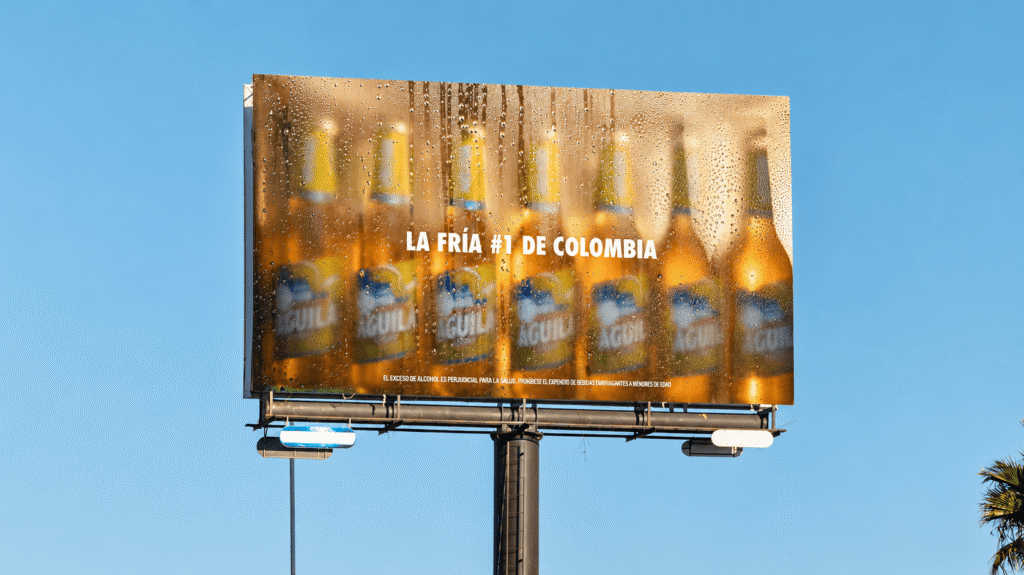
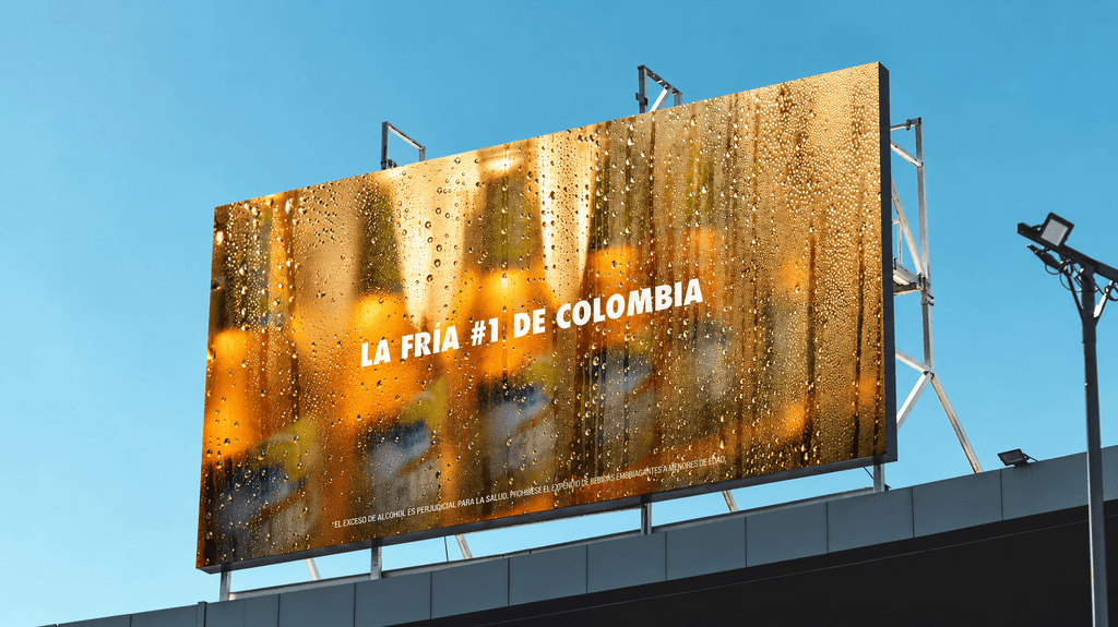
Rows of Águila Light bottles appeared behind a surface covered in water droplets. Their outlines and labels softened beneath the condensation, while one line remained clear in the centre of the billboard. “La fría #1 de Colombia.”
The campaign, “Icedentity,” used that loss of clarity to communicate coldness. Created by DAVID Bogotá for Águila Light in Colombia, it recreated the view of beer through condensation-covered refrigerator glass.
The bottles remained present, but the effect between the viewer and the product became the main message. The beer looked cold because the surface in front of it looked wet, misted and difficult to see through.

Refrigerator glass supplied the visual idea
Condensation forms when humid air meets a sufficiently cold surface. In a refrigerator setting, droplets on the glass can distort the objects behind it, softening shapes and making labels harder to read.
“Icedentity” borrowed that familiar optical effect for the advertising. Its imagery suggested the experience of looking into a cold drinks fridge, with the bottles visible through the moisture.
That gave the outdoor work a connection to the moment of purchase. The same visual obstruction someone might encounter when choosing a refrigerated beer became a cue for how they could expect the drink to feel.
The headline stayed readable through the haze
On the billboard, the white headline held its position against the amber-coloured bottles and streaks of condensation. The phrase presented Águila Light as Colombia’s number-one cold beer.
The line supplied the brand’s claim while the image suggested the sensation behind it. Water droplets, blurred labels and softened bottle shapes all pointed towards the same attribute.
The distinction between the sharp copy and the hazy product gave the layout a clear reading order. Viewers could register the cold-looking surface, then read the message that explained its role.
“Icedentity” extended the effect into a design system
The creative team described a wider visual language built from condensation’s effects. Refraction, diffusion, colour shifts and reduced legibility informed guidelines for softened forms, desaturated tones and blurred finishes.
The idea therefore extended beyond adding droplets to a product photograph. The look of a cold fridge became a repeatable approach for the brand’s communication.
The system appeared across billboards, façades and retail settings. That allowed the condensation treatment to connect large outdoor placements with the places where people encountered and bought the beer.
The cold cue travelled across outdoor and retail
The broader execution used shop surfaces and refrigeration-related touchpoints alongside billboards. These settings gave the effect different scales, from a roadside image to a shopfront or drinks fridge.
Across them, the campaign kept returning to the same observation. Coldness could be communicated through what happened to the view of the product.
“Icedentity” received a Bronze Lion in Outdoor, in the Local Brand category, at Cannes Lions 2026. Its central device remained the condensation itself, giving Águila Light a visual language built around the attribute it wanted people to associate with the beer.
Credits
Brand: Águila Light. Campaign: Icedentity. Agency: DAVID Bogotá. Production: Parche Films, Bogotá. Media: Zenith, Bogotá. Market: Colombia. Recognition: Bronze Lion, Outdoor, Local Brand, Cannes Lions 2026.
About the work
Campaign details
- Brand
- Águila Light
- Agency
- DAVID
- Country
- Colombia
- Year
- 2026
- Awards
- 2026 Cannes Lions - Bronze Lion
Related
More in Outdoor


Popular
Popular posts

More stories