Outdoor
Coca-Cola stretched giant straws from its bottles into the city
 By Archit
·
·
4 min read
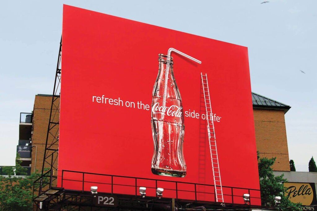
A bottle of Coca-Cola usually needs only a short straw. For a bottle painted across the side of a building, however, the straw had to be much larger.
Coca-Cola used that simple change of scale for a Canadian outdoor campaign in 2010. Giant white straws extended from bottles and travelled beyond the edges of posters, billboards and painted walls.
By connecting the straws with nearby structures, the campaign made it appear as though the city itself was drinking Coca-Cola.
The straws escaped the advertising space
Each execution began with a familiar image: a glass Coca-Cola bottle presented against the brand’s red background.
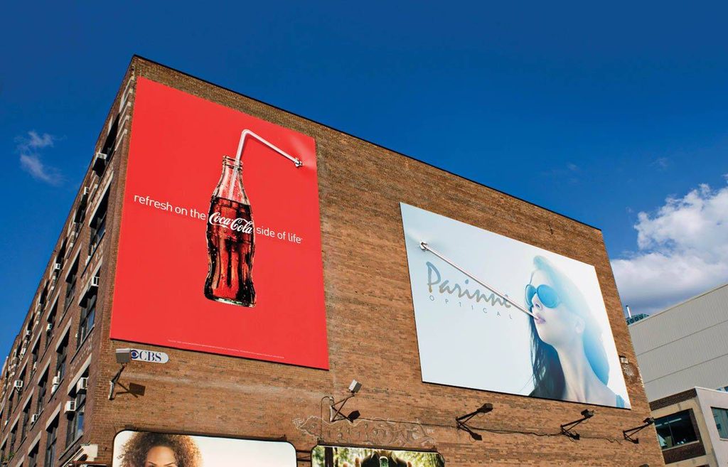
The unexpected element was the straw. Instead of remaining inside the printed composition, it continued into the physical environment surrounding the advertisement.
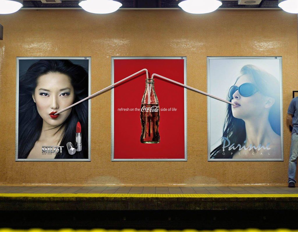
Some straws stretched towards windows above the display. Others interacted with adjacent posters, ladders or the structure supporting a billboard.
The extension blurred the boundary between the advertisement and its location. Viewers could understand where the printed image ended, but the visual idea continued beyond it.
Apartment windows became part of the campaign
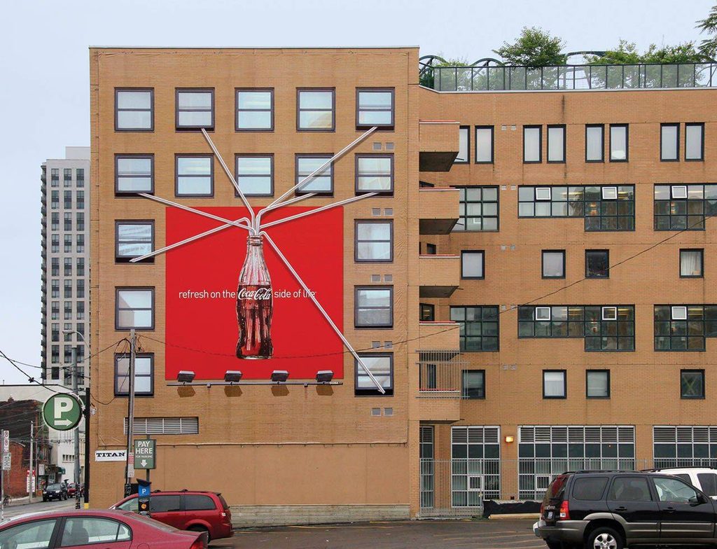
One of the largest executions covered the side of a building with a red Coca-Cola mural.
A bottle appeared near the bottom of the wall while an oversized straw rose towards the windows above it. The positioning created the illusion that someone inside the building could drink directly from the enormous bottle.
The building was no longer simply carrying an advertisement. Its windows completed the joke.
The execution also gave Coca-Cola’s familiar imagery a sense of exaggerated scale. The bottle appeared large enough to refresh an entire building rather than one person.
Everyday structures completed different visuals
The campaign repeated the straw device across four outdoor executions.
Rather than placing the same artwork in multiple locations, each version responded to a different physical setting. Poster frames, wall fixtures, ladders and billboard structures were incorporated into the compositions.
This gave the campaign consistency without making every placement identical. The bottle and white straw remained recognisable, while the surrounding environment determined how each visual worked.
People did not need to stop and read an explanation. Following the straw with their eyes revealed the idea.
Scale turned refreshment into a visual joke
Coca-Cola has long been associated with thirst, refreshment and the act of sharing a drink. The campaign communicated those ideas by exaggerating one of the simplest parts of drinking from a bottle.
A normal straw would have disappeared against a large wall or billboard. Making it oversized transformed it into the main storytelling device.
The contrast between an ordinary drinking action and an impossible architectural scale made the executions immediately playful.
The accompanying line, “Refresh on the Coca-Cola side of life,” connected the unusual visual with the brand’s wider message of enjoyment and refreshment.
The environment carried part of the message
The campaign demonstrated how outdoor advertising can use more than the rectangular space purchased by a brand.
Walls, windows and neighbouring objects became part of the creative execution even though they were not traditional advertising surfaces. The placements were designed around what already existed in each location.
This contextual approach made the campaign more noticeable than a conventional product poster. A viewer could encounter the bottle first and then discover where its straw appeared to lead.
The city provided the final part of each image.
A simple device connected four outdoor executions
MacLaren McCann Toronto created the campaign as a series of four related visuals.
Each used Coca-Cola’s established visual assets: the glass bottle, red background, white typography and familiar curved straw. The new idea came from extending those elements beyond their expected limits.
By turning a small drinking accessory into a piece of urban-scale storytelling, Coca-Cola created an outdoor campaign that could be understood almost instantly.
The bottles remained inside the advertisements, but their straws reached into the world around them.
Credits
Straw outdoor campaign, 2010. Client Coca-Cola, Canada. Agency MacLaren McCann Toronto. Creative Director Sean Davison. Art Director Robert Kingston. Copywriters Wade Hesson and Nancy Crimi. Photographer Frank Hoedl.
About the work
Campaign details
- Brand
- Coca-Cola
- Agency
- MacLaren McCann
- Country
- Canada
- Year
- 2010
Related
More in Outdoor


Popular
Popular posts



More stories