Alzheimer’s Day: Belgian League made a newspaper lose its memory
 By Archit
·
·
3 min read
By Archit
·
·
3 min read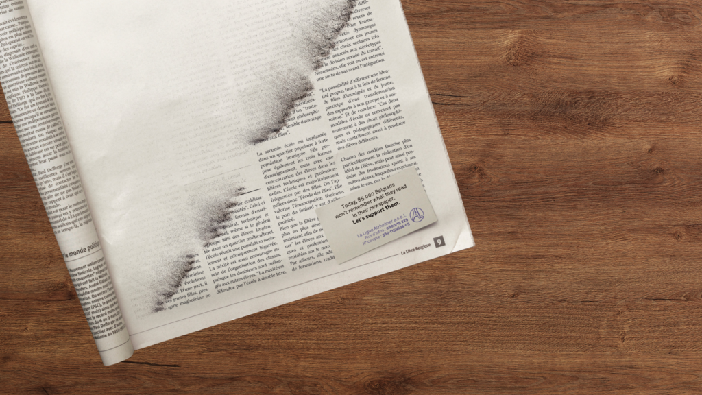
A newspaper page forgot its own story before the reader could finish it. For Alzheimer’s Day in 2010, the Belgian League of Alzheimer used disappearing columns of text to turn memory loss into something a reader could briefly experience. Publicis Brussels created the print ad.
The Page That Could Not Hold a Story
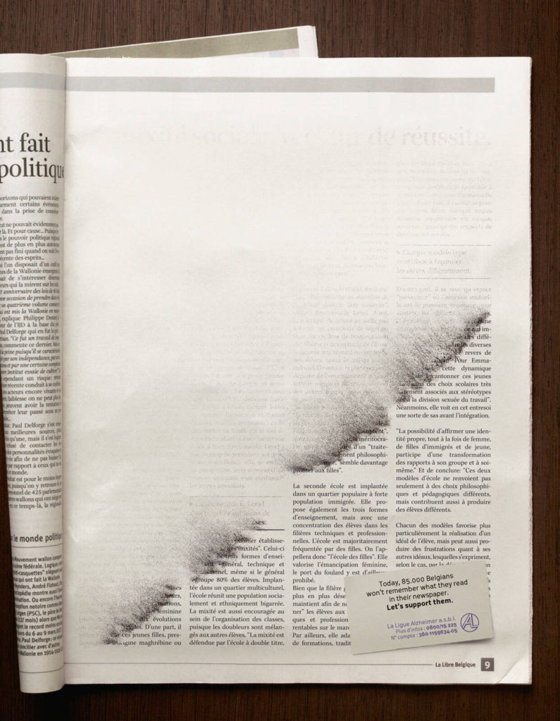
The ad borrowed the familiar structure of a newspaper article. The headline, columns and typography all appeared to belong on the surrounding pages. However, the information gradually became harder to hold onto.
Words faded. Sentences broke apart. Entire sections slipped into the white of the paper.
The disappearing copy was more than a visual reference to forgetting. It interrupted the act of reading itself. The reader could see that information had been printed, yet could no longer recover what it said.
Meanwhile, the remaining text connected that disruption to people living with Alzheimer’s disease and asked readers to support them. The appeal arrived after the page had already created a small moment of confusion.
Why the Newspaper Mattered
A newspaper is designed to preserve information. The article remains available after the first reading. Someone can return to a paragraph, check a name or pass the page to another person.
Alzheimer’s Day changed that basic promise.
The information was physically present, but access to it had begun to disappear. As a result, the medium became part of the message rather than a surface carrying it.
The placement also made the idea personal. Readers encountered the ad while performing an ordinary mental task. They were concentrating, following sentences and trying to remember what they had just read.
Then the page stopped helping them.
That interruption could not explain the full experience of Alzheimer’s disease. Still, it gave readers a direct way into one part of it. Information that should have been available was suddenly beyond reach.
The Craft of Losing Information
The gradual fade carries the whole piece.
A sudden block of empty space would have announced the trick immediately. Instead, the loss spreads slowly enough for the reader to trust the page before recognising that something is wrong.
Publicis also kept the surrounding design restrained. The columns, type and paper tones remained familiar. Furthermore, the faded sections looked like part of the printing process rather than an image placed on top of it.
That realism created uncertainty. The reader might initially wonder whether the newspaper had been damaged or printed incorrectly. Only after looking again did the subject become clear.
More importantly, the design stayed sober. Alzheimer’s disease did not become a puzzle for the reader to solve or a clever visual joke. The fading text led directly back to the people facing the condition.
Why It Still Works
More than fifteen years later, the ad continues to appear in collections of memorable print advertising.
Its strength sits in the relationship between the subject and the medium. Memory loss was not illustrated through a portrait or explained through a long paragraph. Instead, the newspaper briefly failed to perform the task readers expected from it.
The idea also stayed modest in scale. It offered a short disruption, then returned attention to the people living with Alzheimer’s disease and the organisation asking for support.
Print gave the campaign something digital media would struggle to match. The fading words remained fixed on the physical page. A reader could look again, try to recover the article and discover that the missing information was still gone.
The newspaper had not moved. The memory had.
Credits
Alzheimer’s Day (2010). Ligue Nationale Alzheimer Liga, Belgium. Agency: Publicis Brussels.
Related
More in Print




Popular
Popular posts



More stories