Spotlight
IKEA Real Life Series rebuilt famous TV rooms with IKEA furniture
 By Archit
·
·
5 min read
By Archit
·
·
5 min read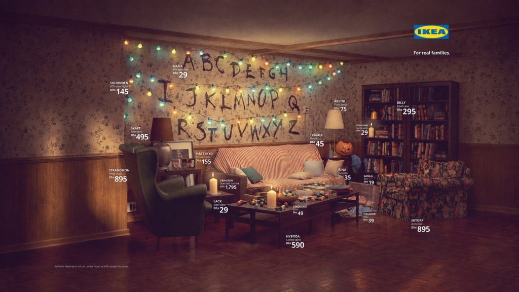
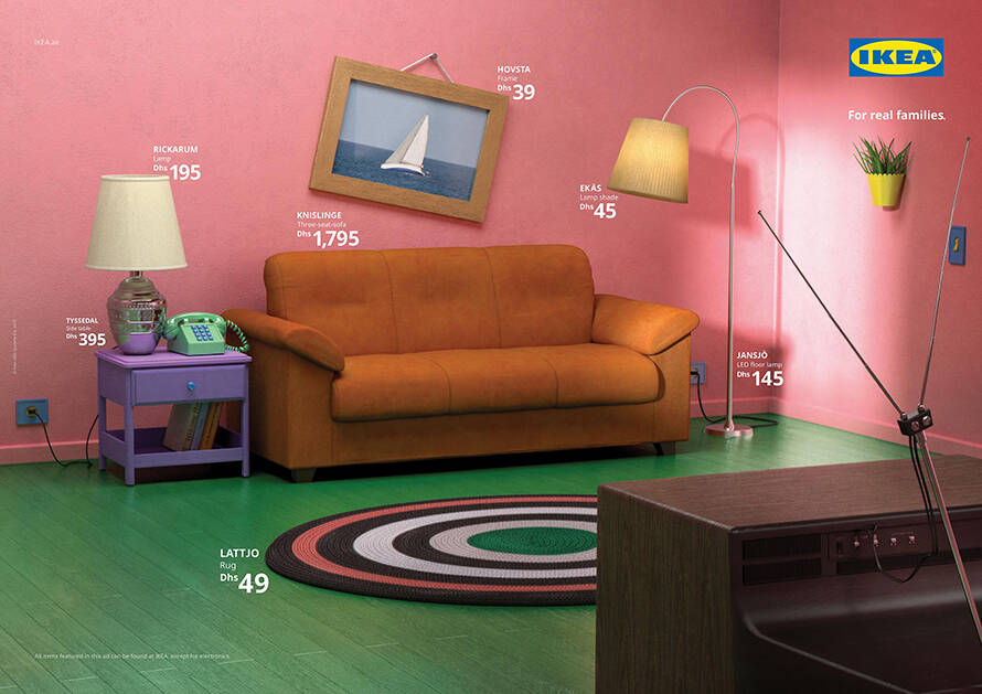
In May 2019, IKEA recreated three familiar television living rooms using products from its own catalogue. The campaign rebuilt spaces from The Simpsons, Friends and Stranger Things, then allowed people to shop the furniture used inside them. Publicis Spain created the IKEA Real Life Series for IKEA UAE.
The rooms belonged to fictional families. The furniture could belong to anyone.
Three television rooms connected a diverse market
IKEA developed the campaign for the United Arab Emirates, where people from many countries, cultures and family structures live together.
That diversity created a communication challenge. One picture of family life could not represent every household the brand wanted to reach.
Publicis found common ground inside international television.
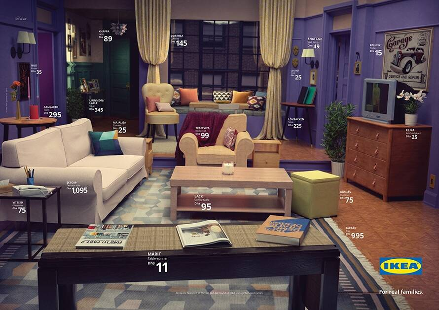
The Simpsons’ orange sofa, Monica and Rachel’s apartment and the Byers family’s living room had been seen by audiences far beyond the countries where the programmes were made. Each room represented a different kind of household.
The Simpsons showed a traditional family home filled with familiar disorder. Friends centred on a group connected by choice rather than birth. Meanwhile, Stranger Things brought a single family’s home into a story shaped by danger and uncertainty.
The campaign did not place the characters inside the advertisements. It used the rooms they had made recognisable.
That kept the furniture at the centre while allowing viewers to complete the scenes from memory.
A two-month search began inside the catalogue
The final images looked immediately familiar, but they were not direct photographs of the original sets.
For two months, the team searched through hundreds of products from the IKEA catalogue and website. Each chair, table, lamp, shelf and accessory needed to resemble an object from one of the television rooms.
The choices then went to a 3D studio, where artist Bruno Rodrigo de Miranda rebuilt the three spaces digitally.
Some IKEA products already came close to the originals. An orange sofa helped reproduce the Simpsons’ living room. A simple coffee table and large shelving units helped create the Friends and Stranger Things scenes.
However, accuracy depended on more than selecting one recognisable item.
The position of the furniture, wall colours, lighting, artwork and small decorative details all helped viewers identify the room. Change too many of them and the reference would disappear.
The team therefore treated the work like set design rather than ordinary product photography.
Every object had to perform two jobs. It needed to resemble something from television while remaining a real item people could buy from IKEA.
The posters became shopping lists
The three room images appeared in print advertisements and point-of-sale posters.
However, the idea did not end with recognising the television reference. IKEA created a dedicated Real Life Series page that grouped the products used in each room.
Someone could see the Friends-inspired image, then find the tables, chairs, lamps and accessories needed to build a similar space at home.
That made the campaign useful after the first visual joke.
The advertisements showed how IKEA products could change through context. A familiar shelf no longer appeared as one item among thousands inside a catalogue. It became part of a room people already understood.
The same system also demonstrated the size of IKEA’s range. Recreating three very different television homes suggested that the catalogue could support many styles rather than one fixed Scandinavian look.
IKEA later announced plans to extend the series through social media and catalogues. Physical versions of the three rooms were also planned for an event in Middle Eastern stores, allowing visitors to enter the spaces rather than only view them in an advertisement.
The campaign moved from screen to catalogue, then pointed back towards a physical room.
Recognition carried the advertising
The Real Life Series used the audience’s memory as part of the art direction.
The campaign did not need character photographs, programme titles or long explanations. A purple door, orange sofa or wall covered with alphabet letters could establish the reference.
That recognition created a small moment of discovery.
First, viewers noticed that the room felt familiar. Then they identified the programme. Finally, they realised that every object had come from IKEA.
The order mattered.
Starting with the product list would have made the campaign feel like a themed catalogue page. Starting with the room turned the catalogue into the solution behind something people already wanted to recreate.
The work also avoided presenting the television spaces as perfect designer interiors. These rooms were remembered because they had been lived in. They carried mismatched furniture, unusual colours and objects collected over time.
IKEA showed that recognisable homes did not need to follow one design rule.
They needed the right combination of pieces.
Why It Still Works
The IKEA Real Life Series made product variety visible without filling the advertisement with claims.
Three images demonstrated that the same retailer could help build a bright animated family room, a colourful shared apartment and a darker 1980s home.
The work also connected inspiration directly with purchase.
People often save rooms from films, television programmes and online images without knowing where to find similar furniture. IKEA closed that gap by identifying the products and placing them together on one page.
More importantly, the campaign understood that people rarely shop for an isolated chair or lamp in their imagination. They picture the life and room around it.
Publicis gave them three rooms they already knew.
IKEA supplied everything needed to make them real.
Credits
IKEA Real Life Series (2019) — IKEA UAE, United Arab Emirates. Agency: Publicis Spain. Chief Creative Officer: Eduardo Marques. Creative Directors: Juliana Paracencio and Luiz Vicente Simões. Art Director: Diego Fernández-Cid. Copywriter: Guillermo Laureano Ley Núñez. 3D Artist and Illustrator: Bruno Rodrigo de Miranda. Interior Design: Carla Klumpenaar. Media: print, point-of-sale, digital, social, catalogues and planned retail experiences. Award: Bronze Lion in Outdoor at Cannes Lions 2019.
Related
More in Spotlight


Popular
Popular posts




More stories