Outdoor
Little Breaks: KitKat hid tiny moments of rest inside its own logo
 By Archit
·
·
5 min read
By Archit
·
·
5 min readAI-assisted
Quick summary
This outdoor advertising campaign coverage details VML UK’s work for Nestlé brand KitKat, titled Little Breaks. Launched across the United Kingdom in April 2026, the campaign reimagines the familiar red-and-white KitKat logo by embedding delicate, hand-drawn miniature scenes within the curves of the lettering.
The restrained minimalist posters feature tiny human figures reading, playing instruments, or daydreaming. Placed in busy commuter locations on long-dwell media, the quiet compositions require viewers to slow down and observe closely, directly mirroring KitKat’s enduring 1957 slogan by turning the act of looking into a personal break.
AI-generated from this article. For complete context and credits, read the full story.
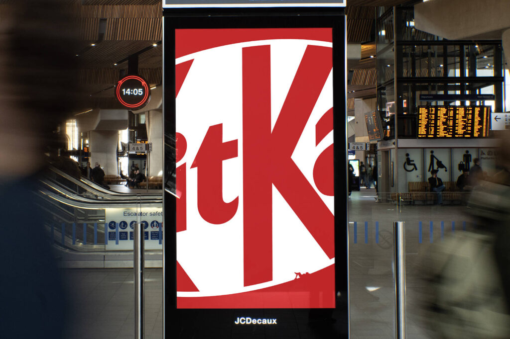
KitKat has turned its familiar red-and-white logo into a collection of miniature scenes celebrating the small ways people pause during a busy day.
Created by VML UK, “Little Breaks” replaces loud advertising messages with delicate hand-drawn illustrations hidden inside the curves of the KitKat lettering.
Look closely and tiny characters can be seen reading a book, playing an instrument, daydreaming or quietly watching the world around them. The scenes transform the logo without making it unrecognisable.
Launched across the United Kingdom in April 2026, the campaign invites people to take the kind of pause it is promoting.
The logo becomes a miniature world
Each execution places a large KitKat logo at the centre of a restrained composition.
From a distance, the posters initially appear almost empty. The familiar red background, logo and product branding make the advertiser easy to recognise, but the main idea remains hidden.
A closer look reveals tiny human figures sitting, standing or relaxing within the letters. The curved forms become landscapes, benches, shelters and quiet spaces in which the illustrated characters can take their breaks.
Instead of placing an image beside the logo, the campaign turns the brand asset itself into the image.
The treatment allows KitKat to tell several small stories while maintaining a consistent visual system across every poster.
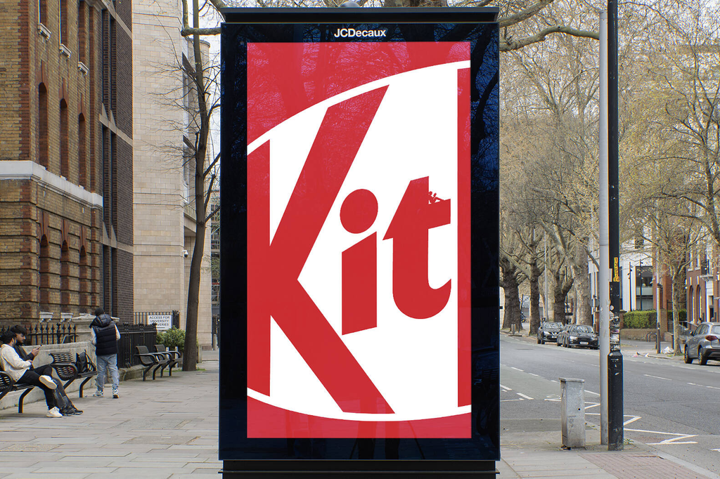
Seeing the idea requires a pause
Most outdoor campaigns try to communicate their message as quickly and loudly as possible.
Little Breaks takes the opposite approach.
The posters provide enough immediate recognition for people to identify KitKat, but understanding each scene requires additional attention. Viewers must slow down, move closer or spend a few extra seconds examining the details.
That behaviour mirrors KitKat’s longstanding message. The campaign does not simply tell people to take a break. It makes taking a visual break part of the experience.
Someone who rushes past may only see the logo. Someone who pauses receives the full story.
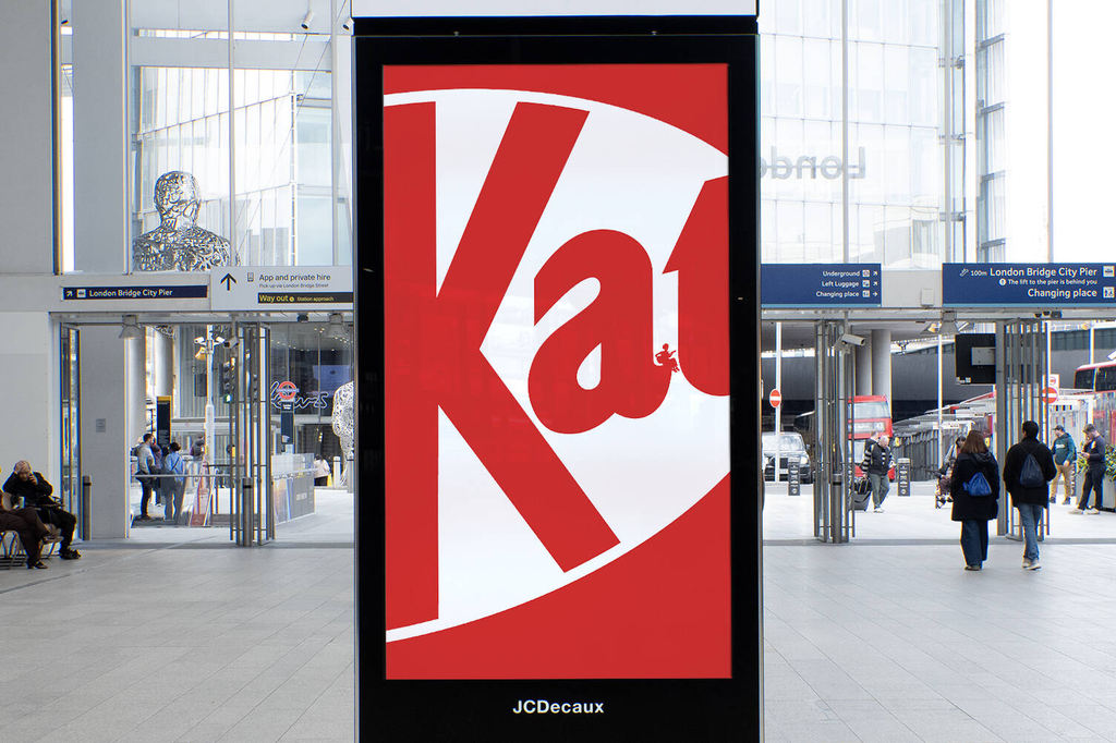
Busy locations make the silence more noticeable
The campaign appeared on long-dwell media in some of the United Kingdom’s busiest locations.
These placements were chosen because commuters and pedestrians are often surrounded by notifications, screens, advertisements and other demands on their attention. Within that environment, KitKat’s restrained posters create a visual contrast.
Large areas of open space reduce the amount of information viewers must process. The tiny illustrations then offer a quiet reward for anyone willing to explore the work.
The approach turns advertising fatigue into part of the strategy. Rather than competing with every surrounding message, KitKat creates a calmer object that stands apart by demanding less.
Everyday activities define the modern break
The campaign avoids depicting expensive holidays, wellness retreats or dramatic escapes.
Its breaks are ordinary and accessible. Reading a few pages, strumming an instrument or allowing the mind to wander can happen during a small gap in almost anyone’s day.
This keeps the idea connected to the way KitKat is consumed. The product is not positioned as the centre of a major occasion but as part of a short, familiar pause.
The scale of the illustrations reinforces that point. These are not life-changing breaks. They are little moments that can still make a meaningful difference.
KitKat refreshes a promise from 1957
“Have a break, have a KitKat” was introduced in 1957 and has become one of advertising’s most enduring brand lines.
The strength of that association allows Little Breaks to communicate without displaying the full slogan prominently. The logo and the behaviour shown inside it are enough for many viewers to complete the connection themselves.
VML UK’s recent work for KitKat has repeatedly explored this level of recognition. Previous posters appeared deliberately unfinished, as though the person creating them had stopped working and taken a break.
Little Breaks develops the idea by moving the pause inside the brand’s visual identity.
Instead of showing what happens when somebody leaves their work, the campaign shows what people may choose to do with the time they reclaim.
Hand-drawn details bring warmth to the system
The illustrations prevent the minimalist layouts from feeling empty or mechanical.
Their handmade quality adds personality to the clean brand graphics, while the small scale creates a sense of discovery. Every execution uses the same basic system but contains a different story.
Animated versions extend those scenes through subtle movement, allowing the tiny characters and their activities to unfold across digital outdoor displays.
The animation remains understated, preserving the campaign’s quiet tone rather than turning it into another fast-moving interruption.
Restraint becomes the creative advantage
Little Breaks demonstrates the confidence that comes from owning a clear and established brand idea.
KitKat does not need to introduce a new slogan or explain why breaks matter. It only needs to give an old promise a new visual form.
By placing quiet scenes inside one of its strongest assets, the brand makes its logo work as identity, illustration and message at the same time.
Campaign reach, engagement and commercial results have not been publicly announced. However, the work shows how outdoor advertising can earn attention by rewarding observation instead of demanding it.
Credits
Little Breaks was created for Nestlé’s KitKat by VML UK, with Ryan McManus as chief creative officer, Sanjiv Mistry as executive creative director, Christopher Joyce as creative director, Zebedee Devey Waterhouse as copywriter, Jasper McIver as art director, Jon Warner as illustrator and senior designer, Sandra Hiralal as lead designer, Jacqui Stecher as head of art and Nick Firth as lead production designer. Strategy was led by Neil Godber and Jordan Adler, with Tim Boxall, Lizzie Alleyne, Victoria Thorniley and Matea Turkulin overseeing the account and project. Animation was produced by Jelly through Sue Loughlin and Tom Henneberry, with George Coffey, Rachinta Platts and Jesse Collett as animators. Media was handled by WPP OpenMind.
About the work
Campaign details
- Brand
- Nestlé
- Agency
- VML
- Country
- United Kingdom
- Year
- 2026
Related
More in Outdoor

Popular
Popular posts


More stories