Outdoor
LoVely: Guinness turned its harp into the letter V to refresh a century-old advertising line
 By Archit
·
·
6 min read
By Archit
·
·
6 min read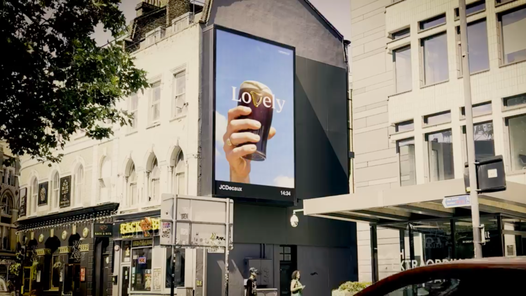
Guinness has found a new idea inside one of its oldest advertising lines by transforming its harp into the letter V in the word “Lovely.”
Created with AMV BBDO, the global campaign is called “LoVely” and presents a new visual expression of “Lovely Day for a Guinness.” In its central design, the letters “Lo” and “ely” appear on either side of the brand’s golden harp, allowing the instrument’s shape to complete the word.
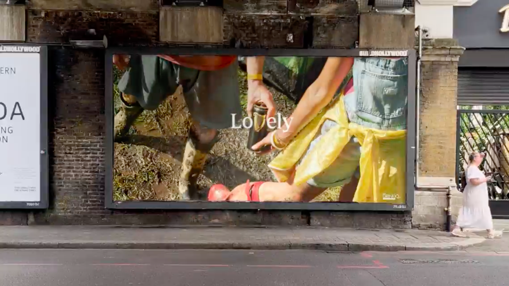
The outdoor campaign pairs this typographic device with closely cropped photographs of pints, people and everyday moments of connection. It is currently appearing across Ireland and Great Britain, with a wider rollout planned for Africa and the Asia-Pacific region.
The idea was already hiding inside the word
The creative device depends on the distinctive shape of the Guinness harp.
When positioned between the letters “Lo” and “ely,” the harp resembles a decorative V. Its familiar golden colour and curved form allow it to remain recognisable as a brand symbol while also performing a new typographic role.
Nothing has been added to the Guinness identity. Instead, the campaign changes how an existing asset is seen.
That restraint is central to the idea. Guinness already has a recognisable colour palette, pint silhouette, type style and harp symbol. “LoVely” uses that familiarity rather than introducing another logo, illustration or campaign character.
The result is a piece of advertising that can communicate the brand before viewers have finished reading the word.
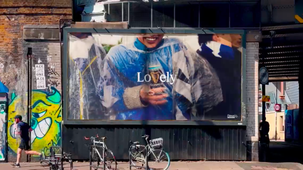
A historic line gets a flexible new identity
“Lovely Day for a Guinness” has roots in the brand’s advertising from the 1930s. Guinness reintroduced the platform in 2025, using it to celebrate the small social occasions that can turn an ordinary day into something memorable.
“LoVely” gives the line a visual identity that can travel across different markets and cultural settings.
The word does not depend on a complicated joke or long piece of copy. It can sit above photographs of friends in a pub, supporters watching football, people attending a music festival or someone enjoying a quiet drink at home.
This flexibility allows the platform to change with the occasion while retaining one consistent element. Whatever the photograph shows, the harp continues to complete the same word.
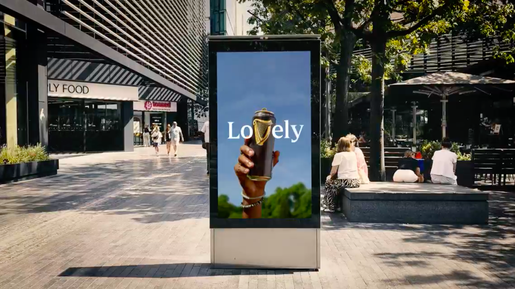
Photography captures ordinary moments of connection
The campaign features photography by Dan Burn-Forti and Peter Franklyn Banks.
Their images focus on authentic, recognisable moments rather than highly polished celebrations. Close crops show pints being carried, people leaning towards one another and groups sharing time together.
The framing often leaves much of the wider situation unseen. This makes the photographs feel like brief observations taken from inside the moment, while the word “LoVely” supplies the emotional interpretation.
A pint of Guinness remains present, but it does not always dominate the composition. The product becomes part of the social situation rather than an object placed separately from it.
This approach supports the wider “Lovely Day” platform, which is built around warmth, humour and everyday human connection.
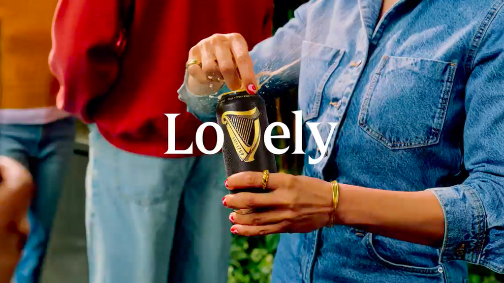
The design can move between football and festivals
Guinness intends to use the visual system across several of its major partnerships and occasions.
It can appear within the brand’s Premier League activity, where photographs of supporters and matchday rituals provide the “lovely” moments. The same format can be adapted for music festivals such as Electric Picnic in Ireland, as well as pubs, homes and other social environments.
This is where the simplicity becomes strategically useful.
A complex campaign would need to be translated or recreated for every setting. “LoVely” provides a recognisable frame into which different photographs, communities and local experiences can be placed.
According to Guinness Global Brand Director Stephen O’Kelly, the campaign reflects the increasingly wide range of occasions in which people enjoy the brand, from football matches and festivals to pubs and homes.
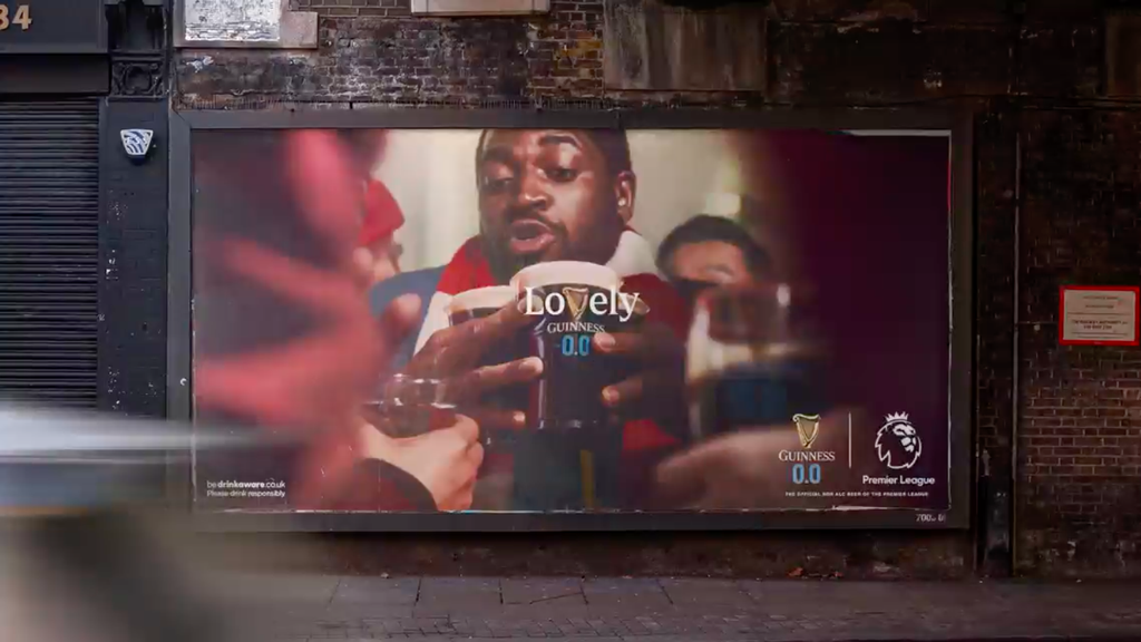
The harp carries more than 160 years of recognition
The Guinness harp has been part of the brand for more than 160 years, making it one of its most established visual assets.
Using it as a letter demonstrates how heritage can be made contemporary without being completely redesigned. The harp keeps its traditional identity but gains a second function within the campaign.
For AMV BBDO Global Creative Director George Hackforth-Jones, the strength of the idea comes from finding something new within an element that was already visible.
The campaign therefore reflects a broader design principle: distinctive brand assets become more valuable when they can be used creatively, not simply repeated in the same position.
By turning the harp into part of the message, Guinness allows its symbol to contribute to the idea rather than merely signing the advertisement.
A small alteration creates a global system
“LoVely” shows how a single typographic adjustment can become a complete campaign platform.
Its effectiveness depends on three familiar elements working together: an established advertising line, a recognisable brand symbol and photographs of relatable social moments.
The campaign began appearing through high-impact outdoor and digital outdoor placements in Ireland and Great Britain. Further executions are expected across Africa and the Asia-Pacific region.
Because the campaign has only recently launched, Guinness has not announced audience figures, commercial results or effectiveness data.
Its immediate achievement lies in the clarity of its design. By placing the harp inside a familiar word, Guinness has refreshed an advertising idea that has existed for generations without losing the heritage that made it valuable.
Credits
“LoVely” was created for Guinness and Diageo by AMV BBDO. The agency team included CEO Xavier Rees, Chief Strategy Officer Jo Arden, Global Chief Creative Officer Chris Beresford-Hill, Creative President Owen Lee, Managing Director Nick Andrew, Global Business Lead Sarah Hore-Lacy, Account Director Jacob Dawjee, Senior Account Manager Harry Frohlich, Account Manager Hollie Clark, Global Strategy Director Sam Williams, Strategist Kerrie Boyes, Creative Director George Hackforth-Jones, Creative Design Director Daniel Mead, Head of Design Vanessa Kendall-Fowler and Senior Art Producer Rhiannon Nicol. Photography was created by Dan Burn-Forti through Making Pictures and Peter Franklyn Banks through Trayler, with retouching by Stanley’s Post and Recom Farmhouse and post-production by Dan Savidge. Stephen O’Kelly is Global Brand Director for Guinness.
About the work
Campaign details
Related
More in Outdoor


Popular
Popular posts

More stories