Festive
McDonald’s Littering Horror gave its Halloween scares an everyday explanation
 By Archit
·
·
3 min read
AI-assisted
Quick summary
McDonald’s Austria and agency DDB Wien launched the print campaign “Littering Horror” in October 2023, using familiar horror-film imagery to draw attention to the environmental impact of discarded takeaway packaging. Across three executions set in dark, misty public spaces, the ads initially presented figures that appeared threatening. Subsequent copy provided harmless explanations for the characters, turning a shadowy figure into a passer-by and revealing that seemingly unsettling poses were actually practical responses to everyday problems.
Once the initial fears were dismissed, the ads redirected readers' attention to discarded McDonald’s cups, paper bags, burger boxes, and fries cartons resting in the scenery. By featuring the brand’s golden arches on both the litter and the campaign signature, the ads placed responsibility for proper disposal directly on the company’s own products. The campaign concluded by asking people to stop the horror at Halloween and throughout the year.
AI-generated from this article. For complete context and credits, read the full story.
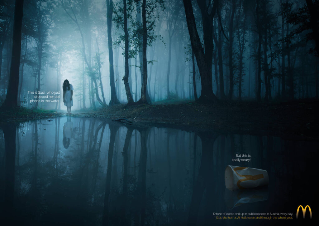
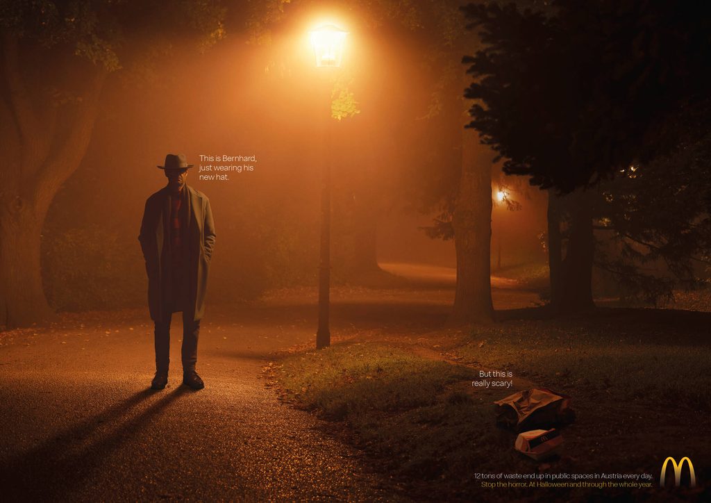
The frightening stranger was wearing a new hat. The woman crouched beside the road was searching for her keys. In McDonald’s “Littering Horror,” the people who appeared to belong in a horror film had ordinary reasons for being there.
Discarded takeaway packaging supplied the campaign’s real warning.
Published in Austria in October 2023, the print series borrowed familiar horror-film imagery to draw attention to littering. Three executions asked viewers to look beyond an apparent threat and notice the rubbish left in public spaces.
The copy took the fear out of the characters
Each ad began with a scene shaped by horror conventions. Darkness, mist, isolated figures and dramatic lighting created the expectation that something frightening was about to happen.
The copy then gave the person a name and a harmless explanation.
Bernhard was simply wearing his new hat. Susi had dropped her phone in the water. Astrid was looking for her keys.
Those explanations changed how the pictures could be read. A shadowy figure became a passer-by. An unsettling pose became a practical response to an everyday problem.
The contrast between the atmosphere and the explanation gave readers a reason to reconsider their first impression. The ads established a fear, explained it away and redirected attention elsewhere within the same frame.

The warning pointed to McDonald’s own packaging
The second piece of copy identified the discarded packaging as the thing worth being concerned about.
A cup, a paper bag, a burger box and a fries carton connected the environmental message to the brand’s own products. The familiar golden arches made that connection visible on the litter as well as in the campaign signature.
That choice gave the message a clear subject. The rubbish belonged to the same world as the advertiser, placing the responsibility for proper disposal close to the moment after a meal.
The packaging sat within recognisable public settings, including a roadside, a park and water in a wooded area. These were places where the consequences of dropping something remained after the person had left.
Halloween supplied the setting for a year-round request
The campaign’s closing message asked people to stop the horror at Halloween and throughout the year.
That extended the idea beyond its seasonal imagery. Halloween provided the vocabulary of fear, while the requested behaviour was straightforward and ongoing.
The people in the ads could explain why they looked frightening. The discarded packaging remained exactly what it first appeared to be, rubbish left where it did not belong.
Credits
Littering Horror (2023). Brand McDonald’s, Austria. Agency DDB Wien. Executive Creative Directors Andreas Spielvogel and Thomas Tatzl. Art Director Marina Mrvka. Copywriters David Hassbach and Jakob Paulnsteiner. Photography Viennapaint Studios.
About the work
Campaign details
- Brand
- McDonald's
- Agency
- DDB Wien
- Country
- Austria
- Occasion
- Halloween
- Year
- 2023
Related
More in Festive

Popular
Popular posts

More stories