Spotlight
Romance Dawn: Nike teased One Piece with a giant Poneglyph in Tokyo
 By Archit
·
·
5 min read
By Archit
·
·
5 min read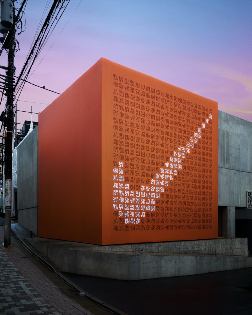
On 6 August 2026, Nike Japan placed a giant orange Poneglyph on a Tokyo street and carved its Swoosh into the fictional stone. The installation appeared with the words “Romance Dawn – The Dawn of Adventure,” a direct reference to the beginning of One Piece. Nike revealed almost nothing else about the collaboration.
That lack of explanation was part of the idea.
Nike entered the story before showing a product
One Piece has spent decades building a world around exploration, hidden history and things that need to be discovered.
Poneglyphs are central to that world. The mysterious stone tablets contain information from the past and can only be understood by a small number of characters.
Nike borrowed that behaviour for its teaser.
Instead of beginning with a shoe photograph, collection name or release date, the brand placed its announcement inside an object fans already knew they were supposed to investigate.
The orange structure appeared around Harajuku’s Cat Street area in Tokyo. Its face was covered in Poneglyph-style writing, while a Nike Swoosh emerged through the markings.
At first glance, the installation looked more like something transported from the manga than a piece of footwear advertising.
That made the audience do some of the work.
Fans photographed the structure, examined its symbols and began trying to understand what Nike was announcing.
Romance Dawn took the collaboration back to the beginning
Nike Japan accompanied the installation with the phrase “ROMANCE DAWN – The Dawn of Adventure -.”
The reference went deep into the source material.
“Romance Dawn” was the name connected with Eiichiro Oda’s early work before One Piece, and it became the title of the manga’s first chapter. Using it allowed Nike to signal the collaboration without placing Luffy or another familiar character across the teaser.
The language also suited the stage of the campaign.
Nothing had properly begun yet.
No complete footwear collection had been revealed through Nike’s official teaser. No detailed product story accompanied the post. Instead, the Poneglyph acted like the first clue in a longer journey.
That restraint was important because reports about a Nike and One Piece collection had circulated months before the installation appeared.
Rumours had already pointed towards footwear inspired by Devil Fruits. However, Nike had not publicly confirmed those product details when it placed the Poneglyph in Tokyo.
The installation therefore did something more useful than repeating a leak.
It gave the collaboration an official beginning in Nike’s own language.
Fans were given something to decode
The markings encouraged exactly the kind of behaviour that surrounds mysteries inside One Piece.
Fans enlarged photographs. They shared translations. They compared numbers and symbols with references from the series.
One interpretation circulated particularly quickly.
The number 5656 appeared in discussion around the installation. In Japanese wordplay, five can be read as “go” and six as “mu,” making 56 or 5656 a familiar reference to “Gomu Gomu,” the name closely associated with Luffy’s rubber powers.
That connection pushed attention towards the Devil Fruit theme already surrounding reports of the collaboration.
Meanwhile, footage shared from the Tokyo installation showed visitors interacting with the object rather than simply walking past it. Online discussion then carried the Poneglyph far beyond the street where Nike had placed it.
The scale of that response came from recognition rather than explanation.
Someone unfamiliar with One Piece could see an unusual orange structure with a Swoosh.
A fan could see a clue.
That difference gave the teaser another layer. The more someone knew about the series, the more there was to investigate.
The product stayed hidden
Sneaker reports before Nike’s teaser had connected the collaboration with three Air Max Plus colourways inspired by Devil Fruits.
The reported themes included Gomu Gomu, Mera Mera and Ope Ope, associated with Luffy, Ace and Law. Apparel had also been mentioned.
However, Nike’s 6 August reveal did not officially confirm those individual models, prices or full release details.
That distinction matters.
The Poneglyph was not a product launch disguised as a mystery. At this stage, it was genuinely a teaser.
Nike showed enough to confirm that something connected with One Piece was happening. Then it stopped.
In fact, the approach gave the brand room to reveal the collaboration in chapters rather than placing every shoe, garment and date into one announcement.
That structure feels particularly natural for a story built around long journeys and discoveries.
The first piece of media did not answer the question.
It made finding the answer feel like part of the campaign.
What Made It Different
Nike could have introduced the collaboration with the easiest assets available.
A Straw Hat logo beside a Swoosh would have explained the partnership immediately. A shoe silhouette would have created product speculation. A character illustration would have produced instant recognition.
Instead, Nike chose an object whose entire purpose in One Piece is to hide information.
That made the medium part of the story.
The Poneglyph also rewarded fans without making the reference completely inaccessible. Its huge scale and strange appearance gave people a reason to photograph it even before they understood what it meant.
Most importantly, the teaser trusted the audience to investigate.
At the time of launch, the collaboration still had more questions than answers.
For One Piece, that felt exactly right.
Credits
Romance Dawn Nike x One Piece Teaser (2026) — Nike Japan and One Piece, Japan. Activation: Poneglyph-inspired installation in Tokyo’s Harajuku area and social teaser. Creative agency, production company and full collaboration credits were not publicly confirmed at the time of writing.
Related
More in Spotlight


Popular
Popular posts



More stories