Greenpeace put ocean life at the other end of a drinking straw
 By Archit
·
·
3 min read
AI-assisted
Quick summary
Greenpeace and agency Rethink launched a print campaign in Canada titled “Straws Suck” to confront consumers and businesses with the impact of disposable plastic. The ads feature a familiar glass filled with ice and a striped plastic straw, but instead of a drink, the lower end pierces the open mouth of a fish, a gull, or a turtle.
By compressing the distance between an everyday convenience and ocean wildlife, the visuals use a refreshing setting to deliver an uncomfortable message. Accompanied by the tagline "Don't suck the life from our oceans," the campaign targets large and small businesses, using the straw as an accessible starting point to rethink the use of single-use items like cups, lids, and containers.
AI-generated from this article. For complete context and credits, read the full story.
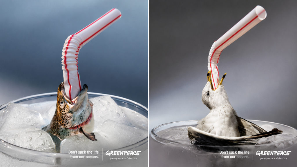
A red-and-white plastic straw rises from a glass packed with ice. At its lower end, a fish’s mouth is stretched around the plastic. Two other executions repeat the scene with a gull and a turtle.
Greenpeace’s “Straws Suck” made an everyday drinking accessory look difficult to swallow. Created by Rethink Toronto and released in Canada in July 2018, the print campaign brought the issue of plastic pollution into a setting people recognised immediately.
Each image carried the same line: “Don’t suck the life from our oceans.”
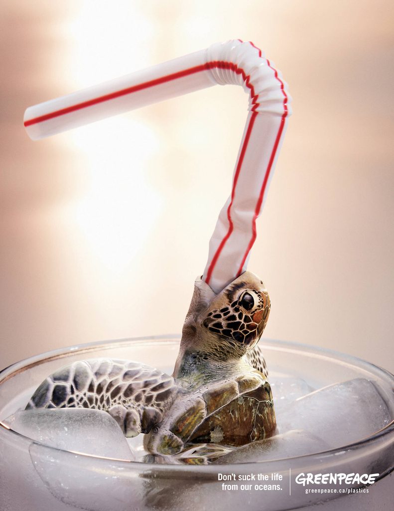
A familiar glass became an uncomfortable image
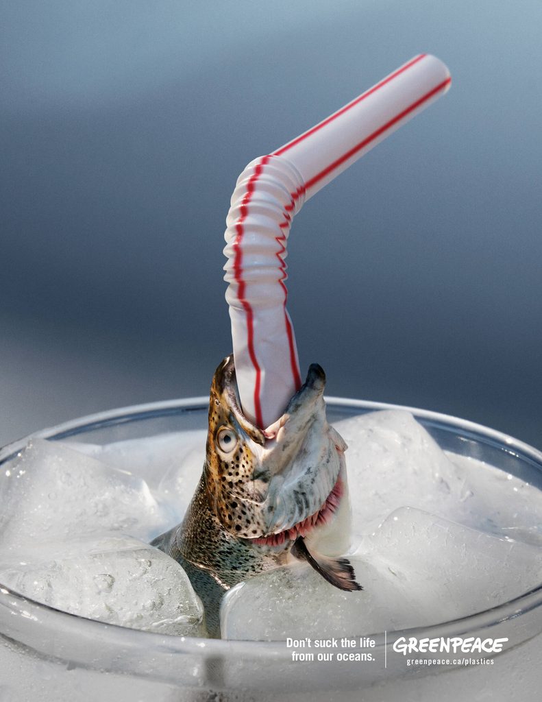
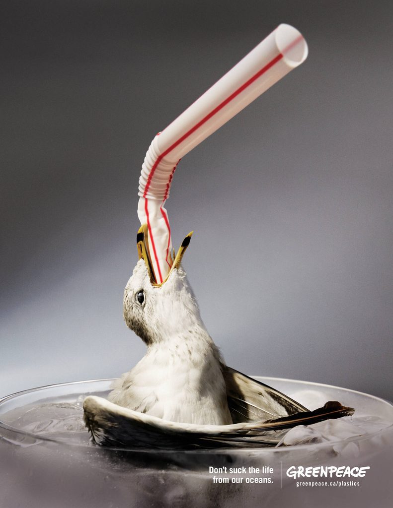
The campaign used the visual language of a refreshing drink. Clear glasses, large ice cubes and softly lit backgrounds made the compositions familiar before the animals changed their meaning.
The striped bendable straw dominated each frame. Its lower section appeared crushed as it entered the animal’s open mouth, giving the plastic a threatening presence.
The fish, gull and turtle occupied the space where a drink would normally sit. That placement connected the convenience of using a straw with the wildlife Greenpeace wanted people to consider.
The images worked through an impossible scene. They compressed the distance between a disposable item in someone’s hand and the ocean environment into a single glass.
The headline completed the connection
The line appeared small at the bottom of each execution, beside the Greenpeace logo. The image did most of the work before the words explained the connection.
“Suck” referred to the ordinary action of drinking through a straw. Paired with the animals, the same word became an accusation about what disposable plastic was taking away.
Across all three ads, the composition stayed consistent. Changing the animal widened the visual story while keeping the message easy to recognise.
The close framing also mattered. Viewers could see the animals’ eyes, mouths and textures, making each subject an individual presence within the glass.
Straws opened a wider conversation
The campaign was aimed at businesses large and small, asking them to reconsider their use of plastic straws. Greenpeace also wanted the discussion to extend to other single-use items, including lids, cups and containers.
That broader ambition gave the straw a specific role: it was an accessible starting point for questioning disposable plastic across a business.
The creative kept that argument focused. A single object, a single animal and a short line gave each execution a clear subject.
By placing wildlife inside the glass, Greenpeace brought the consequence into the same frame as the act of consumption. The ocean was no longer somewhere beyond the picture.
Credits
Client: Greenpeace. Advertising agency: Rethink, Toronto, Canada. Creative Director and Art Director: Joel Holtby. Creative Director and Copywriter: Mike Dubrick. Creative Director: Aaron Starkman. Photography: Instill Image Co. Accounts: Caleb Goodman and Laura Cavalcanti. Print Producer: Narine Artinian. Strategist: Hannah Newport.
About the work
Campaign details
- Brand
- Greenpeace
- Agency
- Rethink
- Country
- Canada
- Year
- 2018
Related
More in Print

Popular
Popular posts


More stories